 README
README
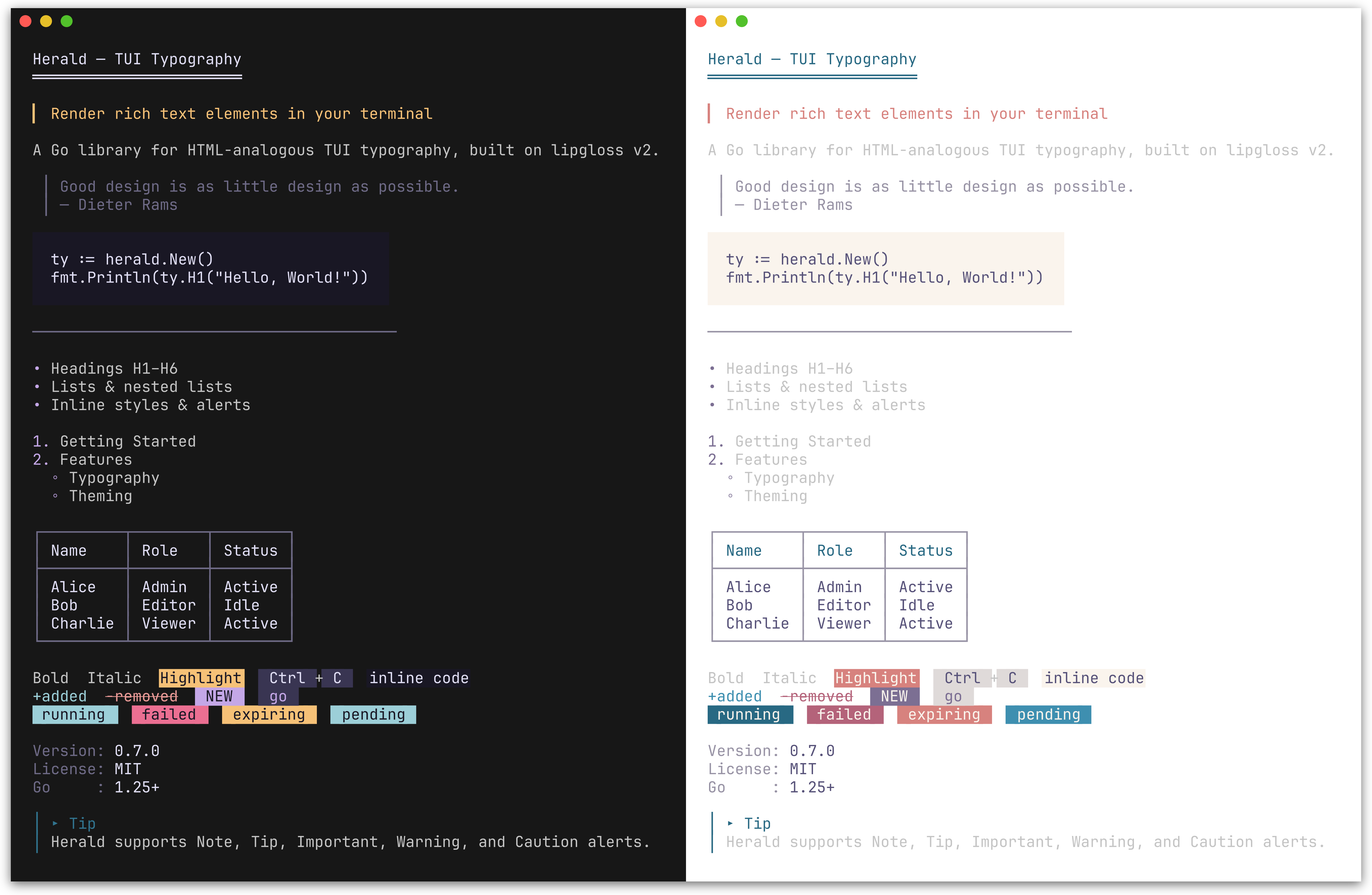
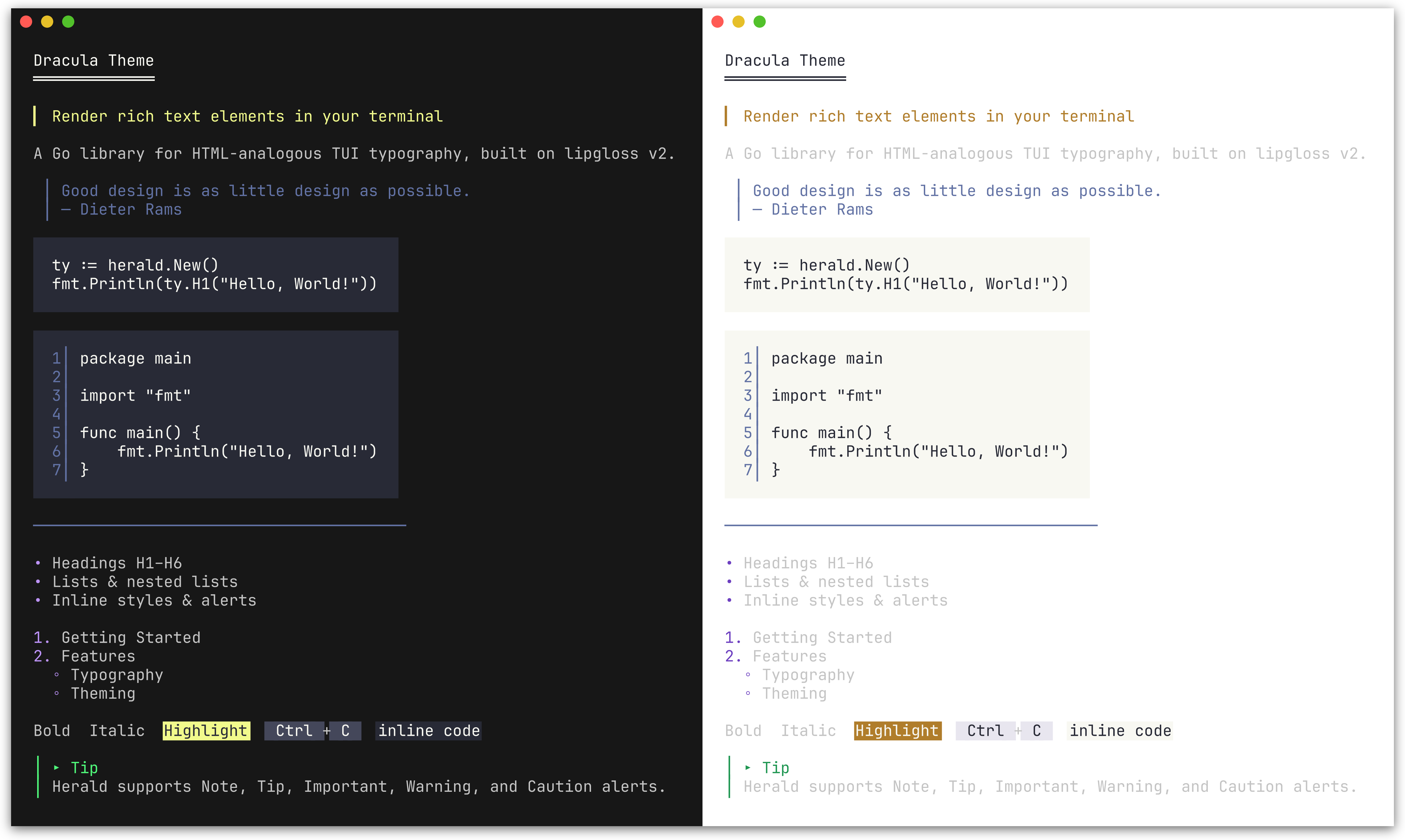
herald
HTML-inspired typography for terminal UIs in Go.


Quick Start | Elements | Composition | Customization | Themes | Ecosystem | Examples
herald maps familiar HTML elements (H1-H6, P, Blockquote, UL, OL, Code, HR, BR, Tables, Alerts, and inline styles) to styled terminal output, built on lipgloss v2.
It ships with a Rose Pine-inspired default theme, built-in themes matching the Charm ecosystem (Dracula, Catppuccin, Base16, Charm), and full style customization via functional options and ColorPalette.
Works with any CLI or TUI - and if you use huh or other Charm-based libraries, the built-in themes pair seamlessly with theirs out of the box.
Default Rose Pine theme (dark and light). herald also ships with Dracula, Catppuccin, Base16, and Charm themes.
Installation
go get github.com/indaco/herald@latest
Requires Go 1.25 or later.
Quick Start
package main

import (
    "fmt"
    "github.com/indaco/herald"
)

func main() {
    ty := herald.New()

    fmt.Println(ty.H1("Getting Started"))
    fmt.Println(ty.P("herald renders terminal typography using lipgloss styles."))
    fmt.Println(ty.UL("Headings", "Block elements", "Inline styles"))
}
[!TIP] Working with Markdown input? herald-md is a companion module that parses Markdown (CommonMark + GFM via goldmark) and maps each element to the corresponding herald typography method - so you can render
.mdcontent with the same themed output, no manual wiring required.go get github.com/indaco/herald-md@latest
[!TIP] Need themed CLI help pages? herald-help renders
--helpoutput with herald's full theming. Adapters for cobra, urfave/cli, and kong are available as sub-modules.go get github.com/indaco/herald-help@latest
Available elements
Headings
Preview
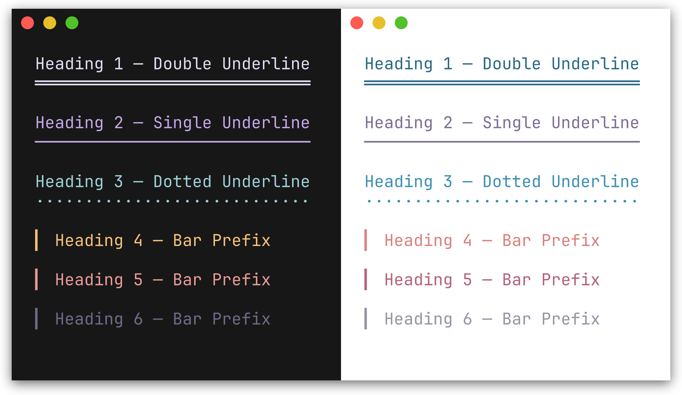
H1-H3 render with a repeated underline character beneath the text. H4-H6 render with a left bar prefix.
| Method | Decoration | Default character |
|---|---|---|
H1(text) |
underline | ═ |
H2(text) |
underline | ─ |
H3(text) |
underline | · |
H4(text) |
bar prefix | ▎ |
H5(text) |
bar prefix | ▎ |
H6(text) |
bar prefix | ▎ |
fmt.Println(ty.H1("Main Title"))
fmt.Println(ty.H2("Section"))
fmt.Println(ty.H4("Subsection"))
Block elements
Preview
| Method | Description |
|---|---|
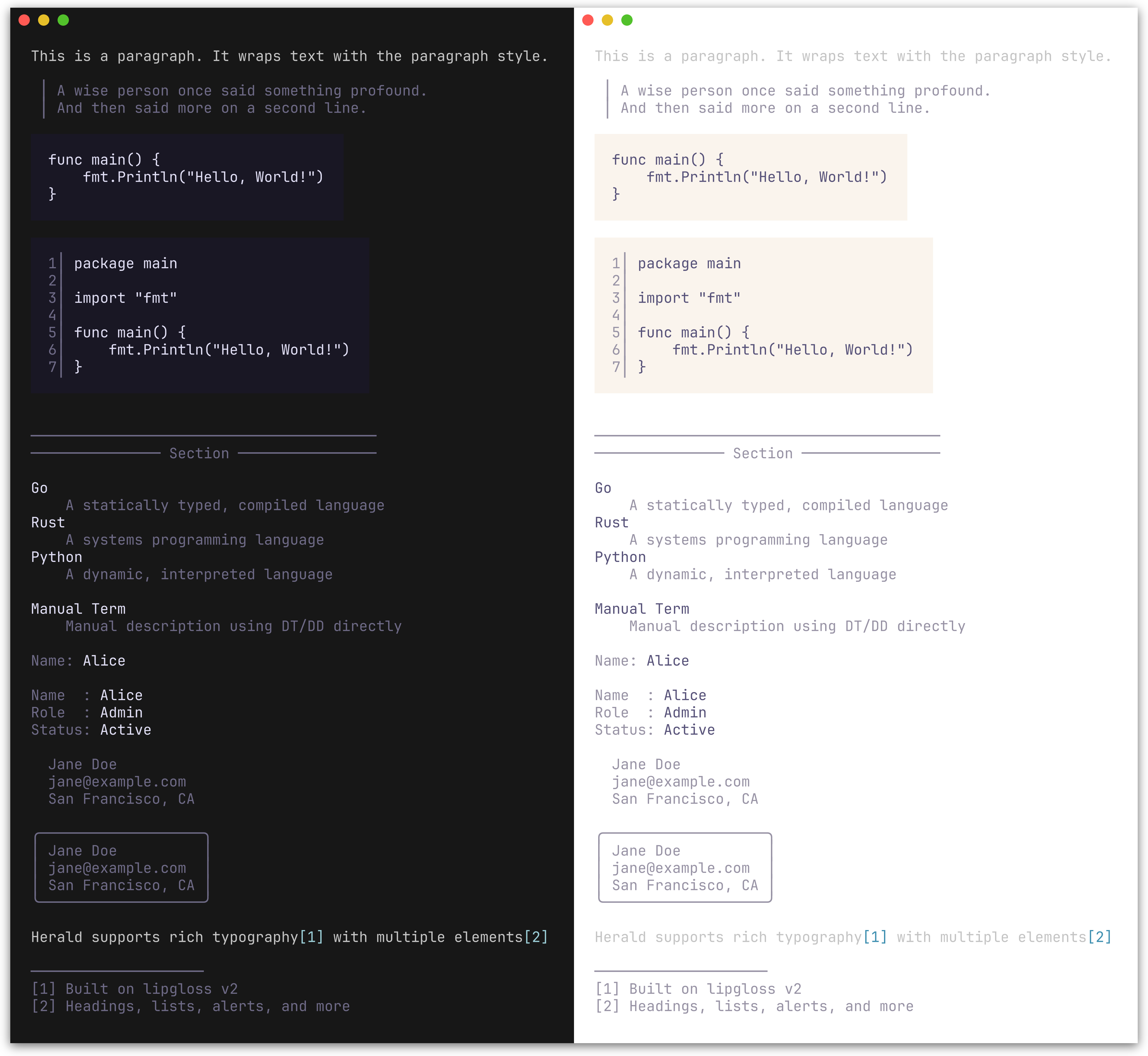
P(text) |
Paragraph |
Blockquote(text) |
Indented block with a left bar; supports multi-line input |
CodeBlock(text, lang) |
Fenced code block with padding; optional line numbers and syntax highlighting |
HR() |
Horizontal rule, configurable width and character |
HRWithLabel(label) |
Horizontal rule with a centered label, e.g. ── Section ── |
DL(pairs) |
Definition list from [][2]string pairs (term, description) |
DT(text) |
Definition term (standalone) |
DD(text) |
Definition description (standalone) |
KV(key, value) |
Key-value pair rendered as key: value with independent styling |
KVGroup(pairs) |
Aligned key-value list from [][2]string pairs; keys are right-padded |
KVGroupWithOpts(pairs, opts...) |
Like KVGroup with per-call options for separator, styling, and indentation |
Address(text) |
Contact/author block; renders multi-line text in a distinctive italic style |
AddressCard(text) |
Bordered card variant of Address with rounded border |
FootnoteRef(n) |
Inline footnote reference marker, e.g. [1] |
FootnoteSection(notes) |
Numbered footnote list with divider; returns "" if notes is empty |
Fieldset(legend, content, width...) |
Bordered box with legend embedded in top border; auto-width or explicit |
Figure(content, caption) |
Content with styled caption below |
FigureTop(content, caption) |
Content with styled caption above |
BR() |
Line break, analogous to <br/> |
Section(blocks...) |
Joins blocks with single newlines; keeps a heading tight against its content |
Compose(blocks...) |
Joins pre-rendered blocks with double newlines; empty blocks are skipped |
fmt.Println(ty.Blockquote("First line.\nSecond line."))

fmt.Println(ty.CodeBlock("func main() {\n\tfmt.Println(\"hello\")\n}"))
fmt.Println(ty.HR())
fmt.Println(ty.HRWithLabel("Section"))

fmt.Println(ty.DL([][2]string{
    {"Go", "A statically typed, compiled language"},
    {"Rust", "A systems programming language"},
}))

// Standalone terms and descriptions
fmt.Println(ty.DT("Go"))
fmt.Println(ty.DD("A statically typed, compiled language"))

// Key-value pairs
fmt.Println(ty.KV("Name", "Alice"))

fmt.Println(ty.KVGroup([][2]string{
    {"Name", "Alice"},
    {"Role", "Admin"},
    {"Status", "Active"},
}))

// KVGroup with per-call options: no separator, pre-styled keys, indented
fmt.Println(ty.KVGroupWithOpts([][2]string{
    {ty.Var("--output"), "Output destination"},
    {ty.Var("--verbose"), "Enable verbose output"},
}, herald.WithKVGroupSeparator(""), herald.WithKVRawKeys(true), herald.WithKVIndent(2)))

fmt.Println(ty.Address("Jane Doe\njane@example.com\nSan Francisco, CA"))

// Footnotes compose with paragraphs via string concatenation
fmt.Println(ty.P("herald supports rich typography" + ty.FootnoteRef(1) + " with multiple elements" + ty.FootnoteRef(2)))
fmt.Println(ty.FootnoteSection([]string{
    "Built on lipgloss v2",
    "Headings, lists, alerts, and more",
}))

// Fieldset: bordered box with legend
fmt.Println(ty.Fieldset("Server Config", "Host:  localhost\nPort:  8080\nTLS:   enabled"))

// Figure: content with caption
fmt.Println(ty.Figure(ty.CodeBlock("SELECT * FROM users"), "Figure 1: Query example"))
fmt.Println(ty.FigureTop(ty.Table([][]string{
    {"Name", "Role"},
    {"Alice", "Admin"},
}), "Table 1: User roles"))
╭─ Server Config ──────────────────────╮
│ Host:  localhost                     │
│ Port:  8080                          │
│ TLS:   enabled                       │
╰──────────────────────────────────────╯
// BR inserts a line break
fmt.Println(ty.P("Line one" + ty.BR() + "Line two"))

// Section groups blocks with single newlines instead of double
fmt.Println(ty.Compose(
    ty.H2("Shopping List"),
    ty.Section(
        ty.H4("Fruits"),
        ty.UL("Apples", "Bananas", "Cherries"),
    ),
    ty.Section(
        ty.H4("Vegetables"),
        ty.UL("Carrots", "Spinach"),
    ),
))
Inline styles
Preview
| Method | Renders as |
|---|---|
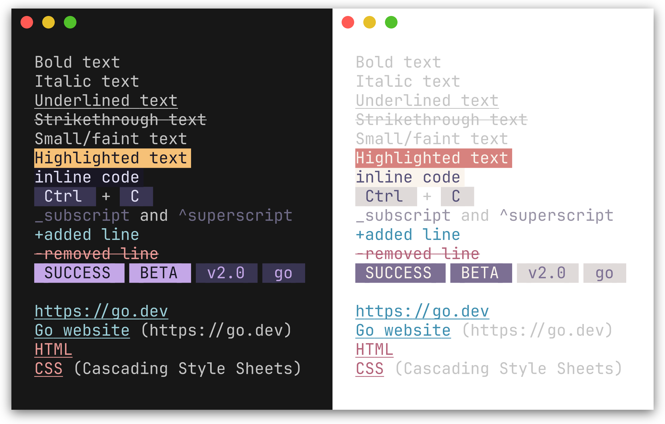
Code(text, lang) |
Inline code with background highlight; lang is optional, used when a CodeFormatter is set |
Bold(text) |
Bold |
Italic(text) |
Italic |
Underline(text) |
Underlined |
Strikethrough(text) |
Strikethrough |
Small(text) |
Faint |
Mark(text) |
Highlighted background |
Link(label, url) |
Styled link; url is optional - when both differ, renders as label (url) |
Kbd(text) |
Keyboard key indicator |
Abbr(abbr, desc) |
Abbreviation; desc is optional, appended in parentheses |
Sub(text) |
Renders with _ prefix (style not configurable via options) |
Sup(text) |
Renders with ^ prefix (style not configurable via options) |
Ins(text) |
Inserted text, prefixed with + |
Del(text) |
Deleted text, prefixed with -, strikethrough |
Q(text) |
Inline quotation with styled curly quotes (\u201C \u201D) |
Cite(text) |
Citation styling (italic + muted) |
Samp(text) |
Sample output styling (monospace, distinct from Code) |
Var(text) |
Variable name styling (italic + accent color) |
Badge(text) |
Styled pill/tag label (e.g. [SUCCESS], [BETA]) |
BadgeWithStyle(text, style) |
Badge with a one-off style override |
Tag(text) |
Subtle pill/category label (lighter variant of Badge) |
TagWithStyle(text, style) |
Tag with a one-off style override |
SuccessBadge(text) |
Badge using the theme's success color (green) |
WarningBadge(text) |
Badge using the theme's warning color (amber) |
ErrorBadge(text) |
Badge using the theme's error color (red) |
InfoBadge(text) |
Badge using the theme's info color (blue) |
SuccessTag(text) |
Tag using the theme's success color |
WarningTag(text) |
Tag using the theme's warning color |
ErrorTag(text) |
Tag using the theme's error color |
InfoTag(text) |
Tag using the theme's info color |
fmt.Println(ty.Bold("important") + " and " + ty.Italic("nuanced"))
fmt.Println(ty.Kbd("Ctrl") + " + " + ty.Kbd("C"))
fmt.Println(ty.Link("Go website", "https://go.dev"))
fmt.Println(ty.Abbr("CSS", "Cascading Style Sheets"))
fmt.Println(ty.Sub("2") + "O" + ty.Sup("n"))
fmt.Println(ty.Ins("added line"))
fmt.Println(ty.Del("removed line"))
fmt.Println(ty.Q("To be, or not to be"))
fmt.Println(ty.Cite("The Go Programming Language"))
fmt.Println("Output: " + ty.Samp("Hello, World!"))
fmt.Println("Set " + ty.Var("PORT") + " to configure the server")
fmt.Println(ty.Badge("SUCCESS") + " " + ty.Badge("BETA"))
fmt.Println(ty.Tag("v2.0") + " " + ty.Tag("go"))

// Semantic variants use the theme's status colors automatically
fmt.Println(ty.SuccessBadge("running"), ty.ErrorBadge("failed"), ty.WarningBadge("expiring"), ty.InfoBadge("pending"))
fmt.Println(ty.SuccessTag("healthy"), ty.ErrorTag("critical"), ty.WarningTag("degraded"), ty.InfoTag("maintenance"))
important and nuanced
[Ctrl] + [C]
Go website (https://go.dev)
CSS (Cascading Style Sheets)
_2O^n
+added line
-removed line
SUCCESS  BETA
v2.0  go
In a color terminal, Badge renders with a filled background pill and Tag with a lighter variant.
Lists
Preview
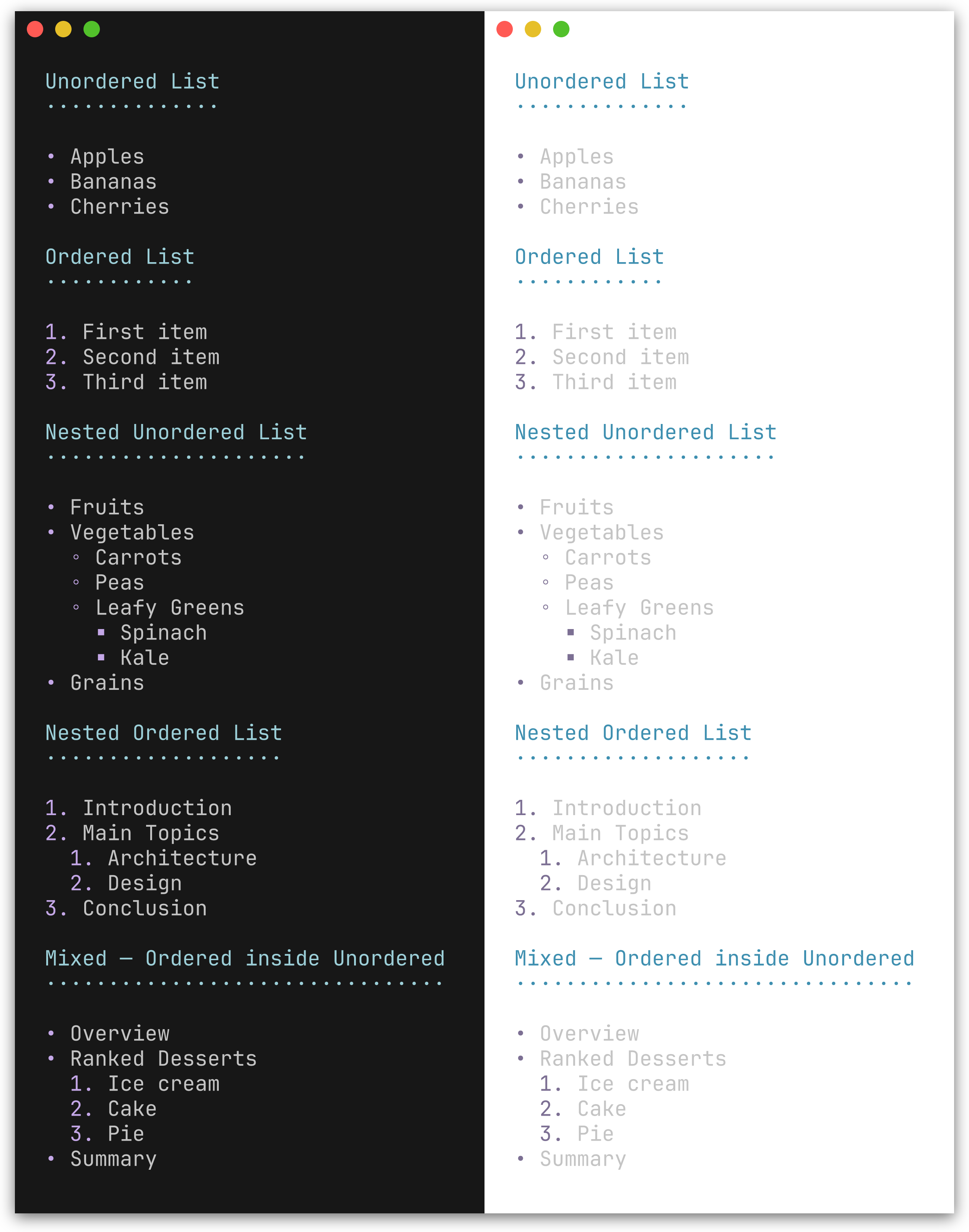
| Method | Description |
|---|---|
UL(items...) |
Unordered list with bullet character (default •) |
OL(items...) |
Ordered list with 1., 2., 3. markers |
NestUL(items...) |
Nested unordered list with bullet cycling |
NestOL(items...) |
Nested ordered list with optional hierarchical numbering |
fmt.Println(ty.UL("Apples", "Bananas", "Cherries"))
fmt.Println(ty.OL("First", "Second", "Third"))
Nested lists
NestUL and NestOL render hierarchical lists with configurable indentation, bullet cycling, and mixed nesting.
Constructors:
| Function | Description |
|---|---|
Item(text) |
Leaf item (no children) |
Items(texts...) |
Batch-convert strings to leaf items |
ItemWithChildren(text, children...) |
Item with unordered sub-list |
ItemWithOLChildren(text, children...) |
Item with ordered sub-list |
// Nested unordered list with mixed sub-lists
fmt.Println(ty.NestUL(
    herald.Item("Fruits"),
    herald.ItemWithChildren("Vegetables",
        herald.Item("Carrots"),
        herald.Item("Peas"),
    ),
    herald.ItemWithOLChildren("Ranked Desserts",
        herald.Item("Ice cream"),
        herald.Item("Cake"),
    ),
))
• Fruits
• Vegetables
  ◦ Carrots
  ◦ Peas
• Ranked Desserts
  1. Ice cream
  2. Cake
// Nested ordered list
fmt.Println(ty.NestOL(
    herald.Item("Introduction"),
    herald.ItemWithOLChildren("Main Topics",
        herald.Item("Architecture"),
        herald.Item("Design"),
    ),
    herald.Item("Conclusion"),
))
1. Introduction
2. Main Topics
  1. Architecture
  2. Design
3. Conclusion
Enable WithHierarchicalNumbers(true) for outline-style numbering (2.1., 2.2.):
ty := herald.New(herald.WithHierarchicalNumbers(true))

fmt.Println(ty.NestOL(
    herald.Item("Introduction"),
    herald.ItemWithOLChildren("Main Topics",
        herald.Item("Architecture"),
        herald.Item("Design"),
    ),
    herald.Item("Conclusion"),
))
1. Introduction
2. Main Topics
  2.1. Architecture
  2.2. Design
3. Conclusion
Tables
Preview
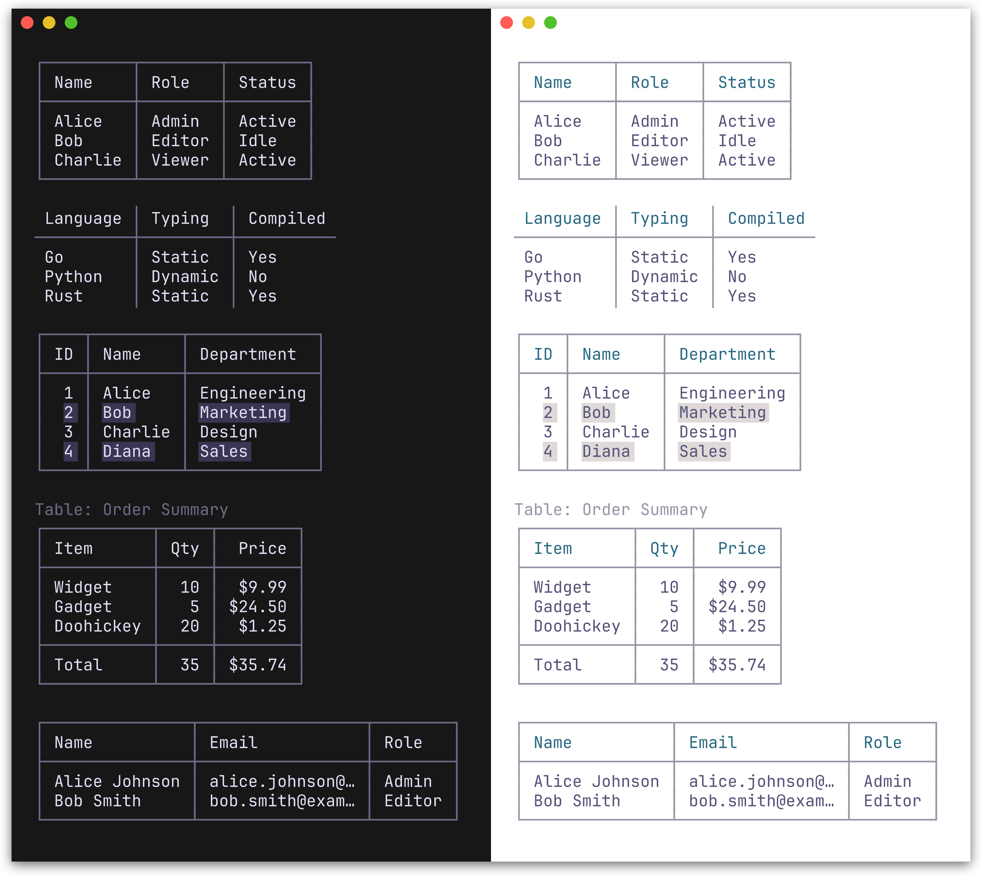
Table renders a table from a [][]string slice. The first row is treated as the header. Two border presets are available: BoxBorderSet() (default, full Unicode box-drawing) and MinimalBorderSet() (header and column separators only, no outer border).
fmt.Println(ty.Table([][]string{
    {"Name", "Role", "Status"},
    {"Alice", "Admin", "Active"},
    {"Bob", "Editor", "Idle"},
}))
Bordered (default):
┌───────┬────────┬────────┐
│ Name  │ Role   │ Status │
├───────┼────────┼────────┤
│ Alice │ Admin  │ Active │
│ Bob   │ Editor │ Idle   │
└───────┴────────┴────────┘
Minimal:
ty := herald.New(herald.WithTableBorderSet(herald.MinimalBorderSet()))
 Name  │ Role   │ Status
───────┼────────┼────────
 Alice │ Admin  │ Active
 Bob   │ Editor │ Idle
TableWithOpts(rows [][]string, opts ...TableOption) accepts per-table options for column alignment, row separators, striped rows, captions, and footer rows:
// Column alignment, footer row, and caption
fmt.Println(ty.TableWithOpts([][]string{
    {"Item", "Qty", "Price"},
    {"Widget", "10", "$9.99"},
    {"Gadget", "5", "$24.50"},
    {"Total", "15", "$34.49"},
},
    herald.WithCaption("Order Summary"),
    herald.WithFooterRow(true),
    herald.WithColumnAlign(1, herald.AlignRight),
    herald.WithColumnAlign(2, herald.AlignRight),
    // Or set all column alignments at once
    // herald.WithColumnAligns(herald.AlignLeft, herald.AlignRight, herald.AlignRight),
))
// Truncate long cell content
ty.TableWithOpts(rows,
    herald.WithMaxColumnWidth(15),
)
| Table option | Description |
|---|---|
WithColumnAlign(col, align) |
Set alignment for a column (AlignLeft/Center/Right) |
WithColumnAligns(aligns...) |
Set alignments for all columns positionally |
WithRowSeparators(true) |
Horizontal lines between body rows |
WithStripedRows(true) |
Alternating row background for readability |
WithCaption(text) |
Caption above the table |
WithCaptionBottom(text) |
Caption below the table |
WithFooterRow(true) |
Treat last row as a styled footer with separator |
WithMaxColumnWidth(n) |
Truncate all columns to n chars with … |
WithColumnMaxWidth(col, n) |
Truncate a specific column (overrides global max) |
Alerts
Preview
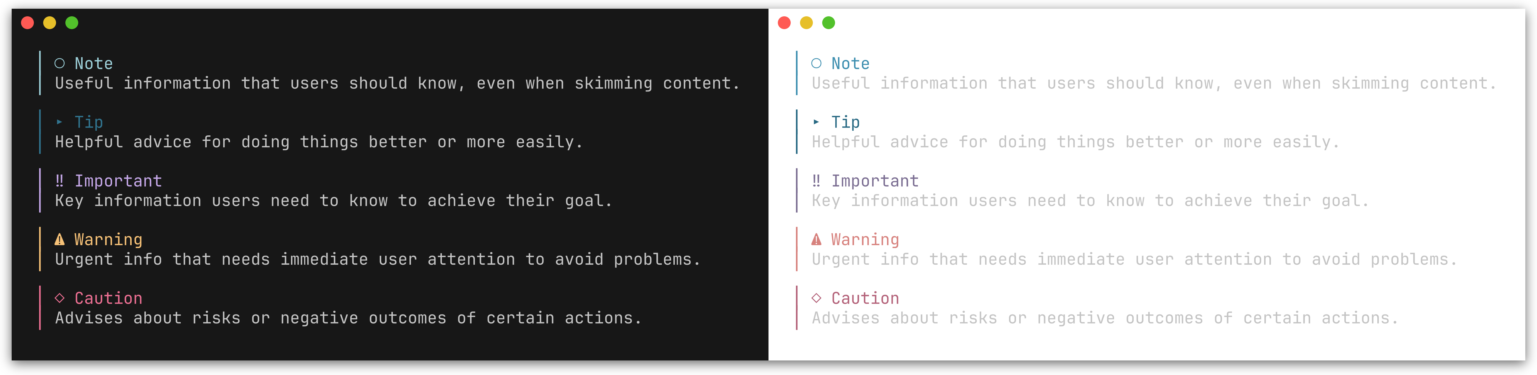
GitHub-style alert callouts with colored bars, icons, and labels. Five types are supported: Note, Tip, Important, Warning, and Caution.
| Method | Icon | Color | Description |
|---|---|---|---|
Note(text) |
○ |
Blue | Useful information for the reader |
Tip(text) |
▸ |
Green | Helpful advice |
Important(text) |
‼ |
Purple | Key information |
Warning(text) |
⚠ |
Amber | Urgent attention needed |
Caution(text) |
◇ |
Red | Risk or negative outcomes |
fmt.Println(ty.Note("Useful information that users should know."))
fmt.Println(ty.Tip("Helpful advice for doing things better."))
fmt.Println(ty.Important("Key information users need to know."))
fmt.Println(ty.Warning("Urgent info that needs immediate attention."))
fmt.Println(ty.Caution("Advises about risks or negative outcomes."))
│ ○ Note
│ Useful information that users should know.

│ ⚠ Warning
│ Urgent info that needs immediate attention.
See examples/002_alerts/ for the full output of all five alert types.
You can also use the generic Alert method with an AlertType:
fmt.Println(ty.Alert(herald.AlertNote, "Generic alert call."))
Composition patterns
herald provides typography primitives - you compose them for higher-level patterns. Here are some common recipes.
Status messages
Combine inline styles for colored status output:
ty := herald.New()

// Success / error with Ins/Del
fmt.Println(ty.Ins("Build completed successfully"))  // green, prefixed with +
fmt.Println(ty.Del("3 tests failed"))                // red, prefixed with -

// Semantic badges use the theme's status colors automatically
fmt.Println(ty.SuccessBadge("PASS") + " " + "All checks passed")
fmt.Println(ty.ErrorBadge("FAIL") + " " + "Linter found 2 issues")
fmt.Println(ty.WarningBadge("EXPIRING") + " " + "Certificate expires in 7 days")
fmt.Println(ty.InfoBadge("PENDING") + " " + "Deployment queued")

// Semantic tags for subtle status labels
fmt.Println(ty.SuccessTag("healthy") + " " + ty.Tag("v2.1.0"))

// Generic Badge/BadgeWithStyle for non-semantic cases
fmt.Println(ty.Badge("BETA") + " " + ty.Tag("go"))
Annotated sections
Pair headings with alerts for contextual guidance:
fmt.Println(ty.Compose(
    ty.H2("Database Migration"),
    ty.Warning("Back up your database before proceeding."),
    ty.P("Run the following command to apply migrations:"),
    ty.CodeBlock("go run ./cmd/migrate up"),
))
Author blocks in release notes
Use AddressCard for styled contact information:
fmt.Println(ty.Compose(
    ty.H2("Release v2.0"),
    ty.P("Major performance improvements and new API surface."),
    ty.AddressCard("Maintained by\nJane Doe\njane@example.com"),
))
Rich paragraphs with references
Compose inline elements and footnotes within paragraphs:
fmt.Println(ty.Compose(
    ty.P(
        "herald" + ty.FootnoteRef(1) + " is built on " +
        ty.Link("lipgloss", "https://github.com/charmbracelet/lipgloss") +
        " and supports " + ty.Bold("rich text") + ", " +
        ty.Code("inline code") + ", and " + ty.Kbd("Ctrl") + "+" + ty.Kbd("C") +
        " key indicators.",
    ),
    ty.FootnoteSection([]string{"A Go library for TUI typography"}),
))
Tight heading-body groups
Compose inserts a blank line (\n\n) between every block. When a heading (e.g. H4) already has MarginBottom, this produces unwanted triple spacing. Section solves this by joining its blocks with a single newline, and the resulting group becomes one block to Compose:
fmt.Println(ty.Compose(
    ty.H2("Release Notes"),
    ty.Section(
        ty.H4("Bug Fixes"),
        ty.UL("Fixed crash on empty input", "Resolved race condition"),
    ),
    ty.Section(
        ty.H4("Features"),
        ty.UL("Added Section method", "Added BR method"),
    ),
))
Global padding and framing
herald renders typography elements. Layout concerns - padding, centering, and framing - belong at the output boundary using lipgloss directly. This avoids double-wrapping when composing inline elements inside block elements.
Per-element wrapping - apply a frame style to each rendered line:
ty := herald.New()
frame := lipgloss.NewStyle().Padding(0, 2)

fmt.Println(frame.Render(ty.H1("Title")))
fmt.Println(frame.Render(ty.P("Body text with " + ty.Bold("bold"))))
Whole-output wrapping - build all output first, then wrap once:
page := ty.Compose(
    ty.H1("Title"),
    ty.P("Body text"),
    ty.HR(),
)
fmt.Println(frame.Render(page))
Customization
Functional options
Pass options to herald.New() to override individual styles or tokens.
ty := herald.New(
    herald.WithHRWidth(60),
    herald.WithBulletChar("-"),
    herald.WithH1Style(
        lipgloss.NewStyle().Bold(true).Foreground(lipgloss.Color("#FF0000")),
    ),
)
Style options - each accepts a lipgloss.Style:
Headings
| Option | Targets |
|---|---|
WithH1Style - WithH6Style |
Heading levels 1-6 |
Blocks
| Option | Targets |
|---|---|
WithParagraphStyle |
P |
WithBlockquoteStyle |
Blockquote text |
WithBlockquoteBarStyle |
Blockquote bar |
WithCodeInlineStyle |
Code |
WithCodeBlockStyle |
CodeBlock |
WithHRStyle |
HR |
WithHRLabelStyle |
HRWithLabel |
Inline
| Option | Targets |
|---|---|
WithBoldStyle |
Bold |
WithItalicStyle |
Italic |
WithUnderlineStyle |
Underline |
WithStrikethroughStyle |
Strikethrough |
WithSmallStyle |
Small |
WithMarkStyle |
Mark |
WithLinkStyle |
Link |
WithKbdStyle |
Kbd |
WithAbbrStyle |
Abbr |
WithInsStyle |
Ins |
WithDelStyle |
Del |
WithQStyle |
Q |
WithCiteStyle |
Cite |
WithSampStyle |
Samp |
WithVarStyle |
Var |
Lists & definitions
| Option | Targets |
|---|---|
WithListBulletStyle |
Bullet/number marker |
WithListItemStyle |
List item text |
WithDTStyle |
Definition term |
WithDDStyle |
Definition description |
Key-value
| Option | Targets |
|---|---|
WithKVKeyStyle |
KV / KVGroup key text |
WithKVValueStyle |
KV / KVGroup value text |
Address
| Option | Targets |
|---|---|
WithAddressStyle |
Address |
WithAddressCardStyle |
AddressCard content |
WithAddressCardBorderStyle |
AddressCard border |
Fieldset
| Option | Targets |
|---|---|
WithFieldsetStyle |
Fieldset content |
WithFieldsetBorderStyle |
Fieldset border |
WithFieldsetLegendStyle |
Fieldset legend |
Figure
| Option | Targets |
|---|---|
WithFigureCaptionStyle |
Figure caption |
Badge & Tag
| Option | Targets |
|---|---|
WithBadgeStyle |
Badge |
WithTagStyle |
Tag |
WithSemanticPalette(sp) |
All 8 semantic methods |
WithSuccessBadgeStyle |
SuccessBadge |
WithWarningBadgeStyle |
WarningBadge |
WithErrorBadgeStyle |
ErrorBadge |
WithInfoBadgeStyle |
InfoBadge |
WithSuccessTagStyle |
SuccessTag |
WithWarningTagStyle |
WarningTag |
WithErrorTagStyle |
ErrorTag |
WithInfoTagStyle |
InfoTag |
Footnotes
| Option | Targets |
|---|---|
WithFootnoteRefStyle |
FootnoteRef |
WithFootnoteItemStyle |
FootnoteSection items |
WithFootnoteDividerStyle |
FootnoteSection divider |
Tables
| Option | Targets |
|---|---|
WithTableHeaderStyle |
Table header cells |
WithTableCellStyle |
Table body cells |
WithTableStripedCellStyle |
Alternating body rows |
WithTableFooterStyle |
Table footer row |
WithTableCaptionStyle |
Table caption text |
WithTableBorderStyle |
Table border characters |
Alerts
| Option | Targets |
|---|---|
WithAlertStyle(type, style) |
Alert of given type |
Callbacks
| Option | Targets |
|---|---|
WithCodeFormatter(fn) |
Syntax-highlighting callback for Code and CodeBlock |
Token options - each accepts a string, int, or bool:
Heading tokens
| Option | Default | Description |
|---|---|---|
WithH1UnderlineChar(c) |
═ |
Underline character for H1 |
WithH2UnderlineChar(c) |
─ |
Underline character for H2 |
WithH3UnderlineChar(c) |
· |
Underline character for H3 |
WithHeadingBarChar(c) |
▎ |
Bar prefix character for H4-H6 |
List tokens
| Option | Default | Description |
|---|---|---|
WithBulletChar(c) |
• |
Bullet character for UL |
WithNestedBulletChars(chars) |
•, ◦, ▪, ▹ |
Bullet characters cycling per depth for NestUL |
WithListIndent(n) |
2 |
Spaces per nesting level for NestUL/NestOL |
WithHierarchicalNumbers(b) |
false |
Outline-style numbering for nested OL (e.g. 2.1.) |
Block tokens
| Option | Default | Description |
|---|---|---|
WithHRChar(c) |
─ |
Character repeated for HR |
WithHRWidth(w) |
40 |
Width of HR in characters |
WithBlockquoteBar(c) |
│ |
Left bar character for Blockquote |
WithCodeLineNumbers(b) |
false |
Show line numbers in CodeBlock |
WithCodeLineNumberSep(c) |
│ |
Separator between line numbers and code |
WithCodeLineNumberOffset(n) |
1 |
Starting line number for code blocks |
Inline tokens
| Option | Default | Description |
|---|---|---|
WithInsPrefix(c) |
+ |
Prefix for Ins (inserted text) |
WithDelPrefix(c) |
- |
Prefix for Del (deleted text) |
WithQuoteOpen(c) |
\u201C |
Opening quote character for Q |
WithQuoteClose(c) |
\u201D |
Closing quote character for Q |
Fieldset tokens
| Option | Default | Description |
|---|---|---|
WithFieldsetWidth(w) |
0 |
Default width for Fieldset (0 = auto-fit) |
Key-value tokens
Theme-level (set via herald.New()):
| Option | Default | Description |
|---|---|---|
WithKVSeparator(c) |
: |
Separator between key and value in KV/KVGroup |
Per-call (passed to KVGroupWithOpts):
| Option | Default | Description |
|---|---|---|
WithKVGroupSeparator(s) |
theme default | Override separator for this call (empty string = no colon) |
WithKVRawKeys(bool) |
false |
Skip applying KVKey style (keys are pre-styled) |
WithKVRawValues(bool) |
false |
Skip applying KVValue style (values are pre-styled) |
WithKVIndent(n) |
0 |
Prepend n spaces of indentation to each line |
Table tokens
| Option | Default | Description |
|---|---|---|
WithTableBorderSet(bs) |
BoxBorderSet() |
Border character set (BoxBorderSet or MinimalBorderSet) |
WithTableCellPad(n) |
1 |
Spaces of padding inside each table cell |
Footnote tokens
| Option | Default | Description |
|---|---|---|
WithFootnoteDividerChar(c) |
─ |
Character repeated for footnote section divider |
WithFootnoteDividerWidth(w) |
20 |
Width of footnote section divider |
Alert tokens
| Option | Default | Description |
|---|---|---|
WithAlertBar(c) |
│ |
Left bar character for alerts |
WithAlertIcon(type, icon) |
per-type | Override icon for a specific alert type |
WithAlertLabel(type, label) |
per-type | Override label for a specific alert type |
Code formatting
WithCodeFormatter accepts a func(code, language string) string callback. When set, Code() and CodeBlock() pass the raw text and language string to the formatter before applying the lipgloss style.
import (
    "strings"

    "github.com/alecthomas/chroma/v2/quick"
    "github.com/indaco/herald"
)

func chromaFormatter(style string) func(code, language string) string {
    return func(code, language string) string {
        var buf strings.Builder
        err := quick.Highlight(&buf, code, language, "terminal256", style)
        if err != nil {
            return code
        }
        return strings.TrimRight(buf.String(), "\n")
    }
}

ty := herald.New(
    herald.WithCodeFormatter(chromaFormatter("catppuccin-mocha")),
)

fmt.Println(ty.CodeBlock(`func main() { fmt.Println("hello") }`, "go"))
See examples/200_chroma-syntax-highlighting/ for a chroma-based example, or examples/201_tree-sitter-syntax-highlighting/ for a tree-sitter-based alternative.
Line numbers in code blocks
Enable line numbers with WithCodeLineNumbers(true). Line numbers are right-aligned, styled with CodeLineNumber (defaults to the Muted palette color), and separated from code by CodeLineNumberSep (default │). Line numbers are added after the CodeFormatter runs, so they work with syntax highlighting.
ty := herald.New(
    herald.WithCodeLineNumbers(true),
)

fmt.Println(ty.CodeBlock("func main() {\n\tfmt.Println(\"hello\")\n}", "go"))
1│ func main() {
2│     fmt.Println("hello")
3│ }
When displaying a snippet from a larger file, set a custom starting line number with WithCodeLineNumberOffset:
ty := herald.New(
    herald.WithCodeLineNumbers(true),
    herald.WithCodeLineNumberOffset(42),
)

fmt.Println(ty.CodeBlock("func greet(name string) string {\n\treturn \"Hello, \" + name\n}"))
42│ func greet(name string) string {
43│     return "Hello, " + name
44│ }
Customize the separator and style:
ty := herald.New(
    herald.WithCodeLineNumbers(true),
    herald.WithCodeLineNumberSep(":"),
    herald.WithCodeLineNumberStyle(lipgloss.NewStyle().Foreground(lipgloss.Color("#888888"))),
)
The following option controls the visual appearance of line numbers:
| Option | Targets |
|---|---|
WithCodeLineNumberStyle |
Code block line numbers |
Themes
Built-in themes
herald ships with named themes that match huh's built-in color palettes. Colors auto-adapt to light/dark terminal backgrounds using lipgloss.HasDarkBackground. See Pairing with huh for how to use matching themes across herald and huh.
 DraculaTheme() |
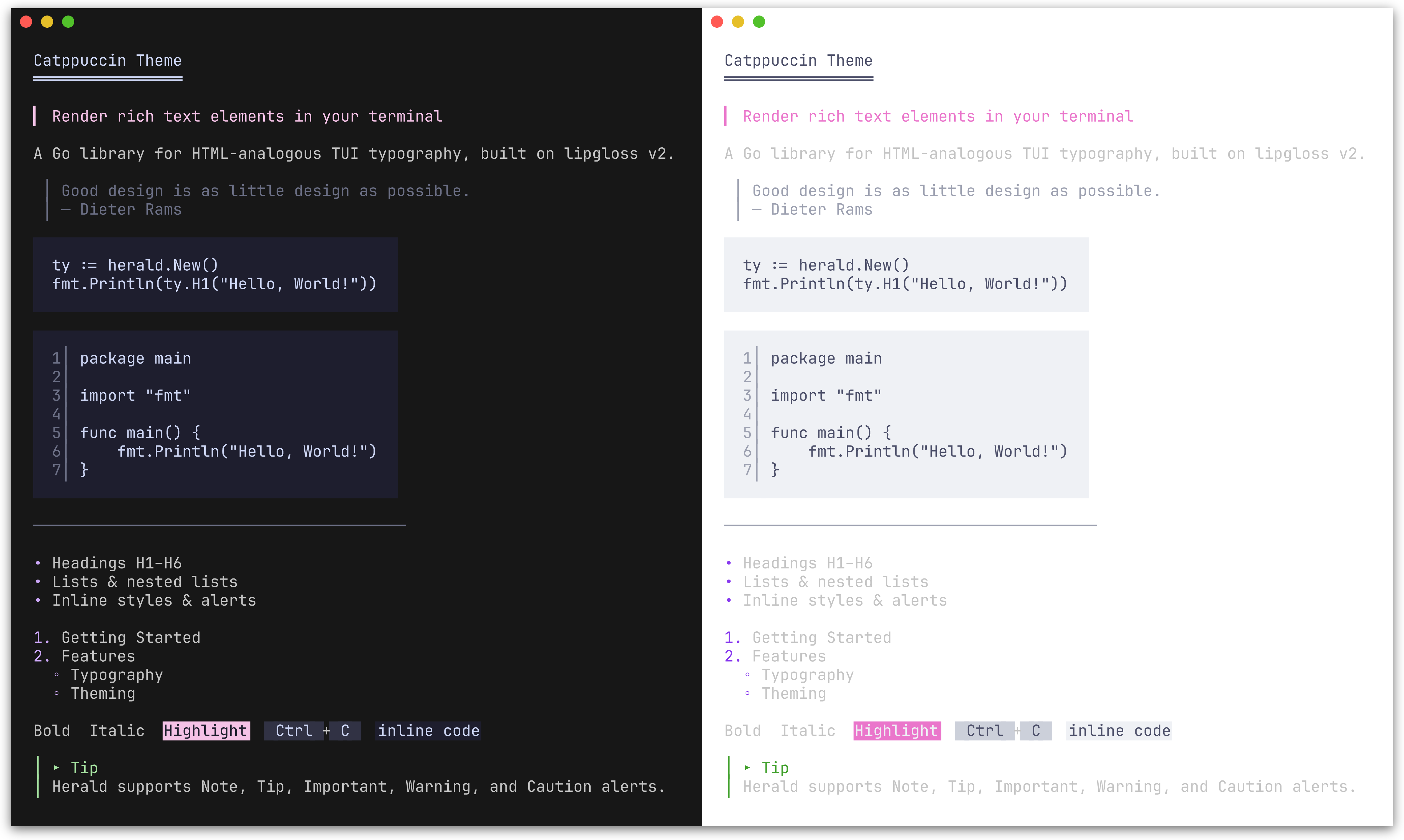 CatppuccinTheme() |
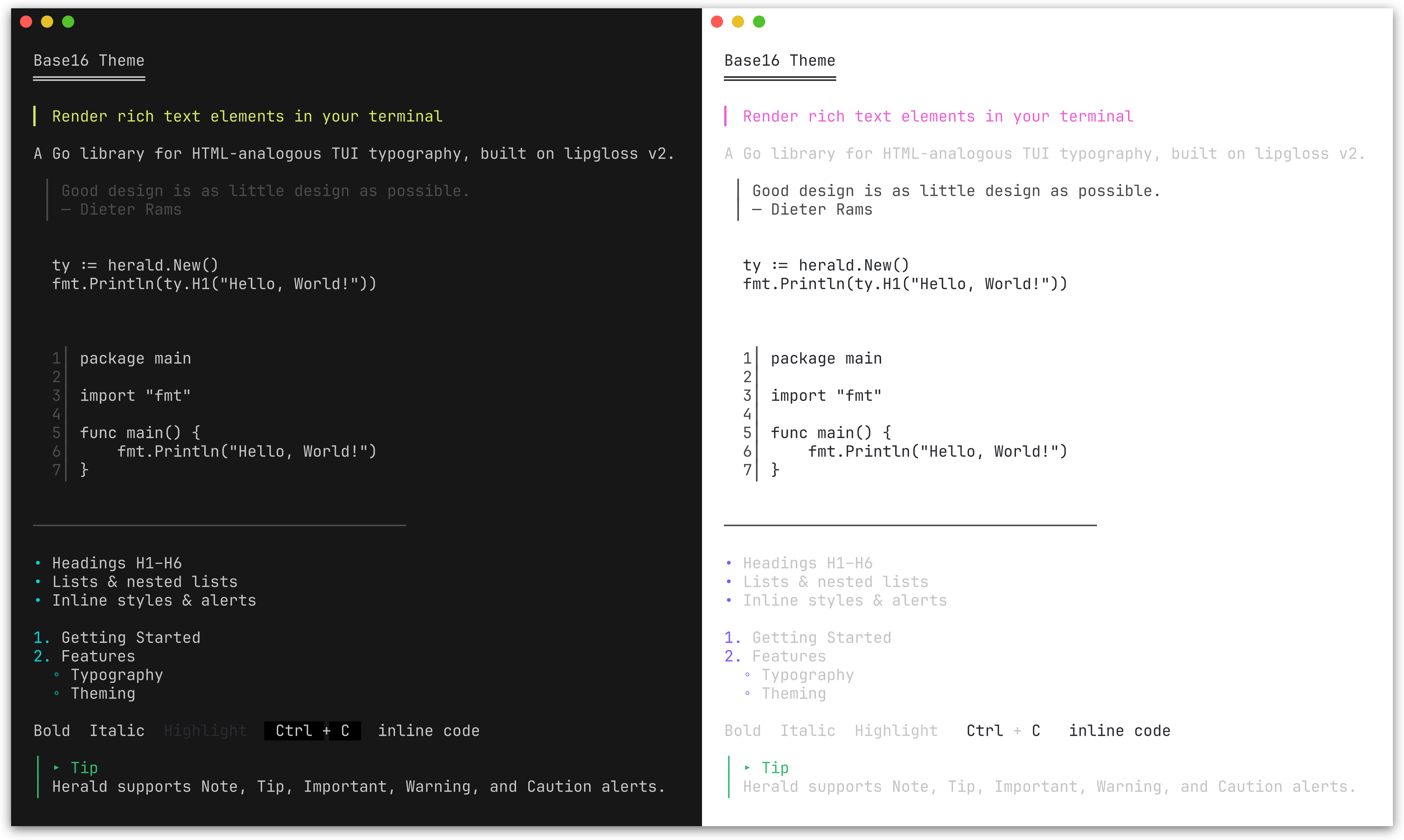 Base16Theme() |
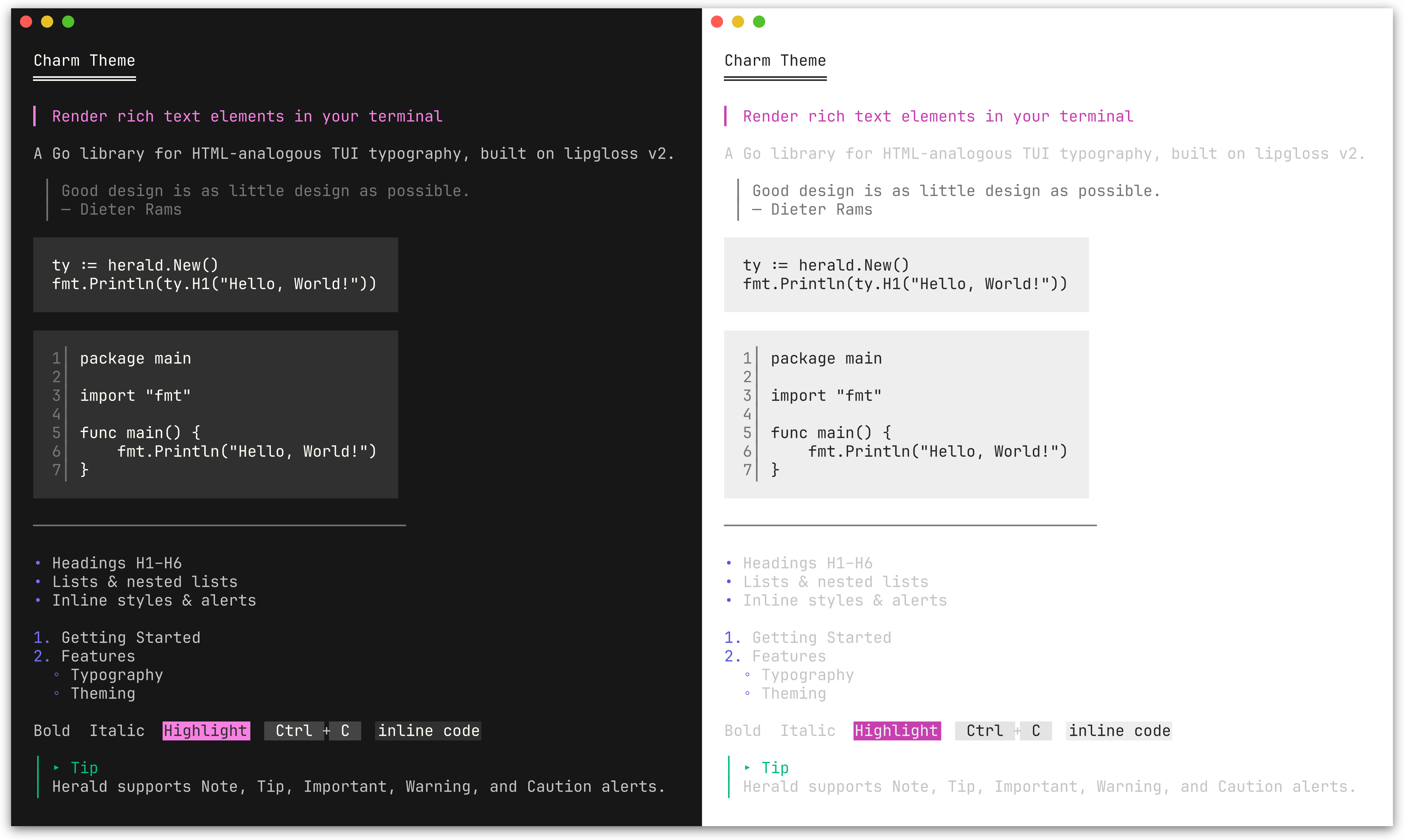 CharmTheme() |
ty := herald.New(herald.WithTheme(herald.DraculaTheme()))
Color palette
ColorPalette lets you define 9 colors and derive a complete theme from them. All style fields map from this palette; token options (characters, widths) are unaffected and retain their defaults. Alert colors are handled separately via AlertPalette.
| Field | Maps to |
|---|---|
Primary |
H1 headings |
Secondary |
H2, list bullets, Badge background, Tag foreground |
Tertiary |
H3, links, Ins, FootnoteRef |
Accent |
H4, mark background, Var |
Highlight |
H5, Abbr, Del |
Muted |
H6, blockquote, HR, HRLabel, sub/sup, DD, KVKey, Address, AddressCard, AddressCardBorder, FootnoteItem, FootnoteDivider, line numbers, table border, caption, Q, Cite, FigureCaption, FieldsetBorder |
Text |
Body text, paragraphs, list items, inline code, DT, KVValue, table cells, footer, Samp, Fieldset content |
Surface |
Background for Kbd, Tag, striped table rows |
Base |
Background for inline code, code blocks; mark fg, Badge fg |
Pass the palette to New() via WithPalette, or call ThemeFromPalette to construct a Theme value directly.
Use lipgloss.LightDark to define adaptive colors that automatically adjust to the terminal's background:
lightDark := lipgloss.LightDark(lipgloss.HasDarkBackground(os.Stdin, os.Stdout))

// Nord-inspired palette
palette := herald.ColorPalette{
    Primary:   lightDark(lipgloss.Color("#5E81AC"), lipgloss.Color("#88C0D0")),
    Secondary: lightDark(lipgloss.Color("#81A1C1"), lipgloss.Color("#81A1C1")),
    Tertiary:  lightDark(lipgloss.Color("#8FBCBB"), lipgloss.Color("#8FBCBB")),
    Accent:    lightDark(lipgloss.Color("#EBCB8B"), lipgloss.Color("#EBCB8B")),
    Highlight: lightDark(lipgloss.Color("#BF616A"), lipgloss.Color("#BF616A")),
    Muted:     lightDark(lipgloss.Color("#7B88A1"), lipgloss.Color("#4C566A")),
    Text:      lightDark(lipgloss.Color("#2E3440"), lipgloss.Color("#ECEFF4")),
    Surface:   lightDark(lipgloss.Color("#D8DEE9"), lipgloss.Color("#3B4252")),
    Base:      lightDark(lipgloss.Color("#ECEFF4"), lipgloss.Color("#2E3440")),
}

ty := herald.New(herald.WithPalette(palette))
Each lightDark(lightColor, darkColor) call returns a single adaptive color that picks the right variant based on the terminal background. This is the same approach used by herald's built-in themes and DefaultTheme().
Plain lipgloss.Color values (without LightDark) work too - they apply the same color regardless of terminal background.
Semantic palette
SemanticPalette defines four status colors used to derive the themed SuccessBadge, WarningBadge, ErrorBadge, InfoBadge, SuccessTag, WarningTag, ErrorTag, and InfoTag styles.
| Field | Semantic meaning | Default derivation from ColorPalette |
|---|---|---|
Success |
Running, passed, healthy | Tertiary (green in most themes) |
Warning |
Expiring, degraded | Accent (amber in most themes) |
Error |
Failed, critical, down | Highlight (red in most themes) |
Info |
Informational, neutral status | Secondary (blue in most themes) |
ThemeFromPalette automatically derives a SemanticPalette from your ColorPalette, so existing custom palettes produce valid semantic badge and tag styles without any changes.
Use WithSemanticPalette to override all four semantic colors at once:
ty := herald.New(
    herald.WithSemanticPalette(herald.SemanticPalette{
        Success: lipgloss.Color("#22c55e"),
        Warning: lipgloss.Color("#f59e0b"),
        Error:   lipgloss.Color("#ef4444"),
        Info:    lipgloss.Color("#3b82f6"),
    }),
)
Individual styles can be overridden with WithSuccessBadgeStyle, WithErrorTagStyle, and the other per-variant options listed in Badge & Tag.
Alert palette
AlertPalette lets you override the 5 alert colors independently from the main ColorPalette. By default, alert colors are derived from the semantic palette (DefaultAlertPalette maps Info->Note, Success->Tip, Warning->Warning, Error->Caution), with Important using ColorPalette.Secondary. Changing the semantic palette therefore updates alert colors too.
Use WithAlertPalette to override all 5 alert colors independently:
ty := herald.New(
    herald.WithAlertPalette(herald.AlertPalette{
        Note:      lightDark(lipgloss.Color("#0969DA"), lipgloss.Color("#58A6FF")),
        Tip:       lightDark(lipgloss.Color("#1A7F37"), lipgloss.Color("#3FB950")),
        Important: lightDark(lipgloss.Color("#8250DF"), lipgloss.Color("#D2A8FF")),
        Warning:   lightDark(lipgloss.Color("#9A6700"), lipgloss.Color("#D29922")),
        Caution:   lightDark(lipgloss.Color("#CF222E"), lipgloss.Color("#F85149")),
    }),
)
Individual alert icons and labels can also be customized:
ty := herald.New(
    herald.WithAlertIcon(herald.AlertTip, "💡"),
    herald.WithAlertLabel(herald.AlertNote, "Info"),
)
You can combine WithPalette with other options to override specific fields after the palette is applied:
ty := herald.New(
    herald.WithPalette(palette),
    herald.WithHRWidth(60),
    herald.WithBulletChar("-"),
)
Custom theme
The easiest way to customize is to start from an existing theme and modify specific fields:
custom := herald.DefaultTheme()
custom.H1 = lipgloss.NewStyle().Bold(true).Foreground(lipgloss.Color("#FF0000")).MarginBottom(1)
custom.BulletChar = "-"

ty := herald.New(herald.WithTheme(custom))
For a fully custom theme, construct a Theme struct directly:
custom := herald.Theme{
    H1:        lipgloss.NewStyle().Bold(true).Foreground(lipgloss.Color("#FFFFFF")),
    H2:        lipgloss.NewStyle().Bold(true).Foreground(lipgloss.Color("#AAAAAA")),
    Paragraph: lipgloss.NewStyle().MarginBottom(1),
    // set remaining Theme fields as needed...

    H1UnderlineChar: "=",
    H2UnderlineChar: "-",
    H3UnderlineChar: ".",
    HeadingBarChar:  ">",
    BulletChar:      "*",
    HRChar:          "-",
    HRWidth:         40,
    BlockquoteBar:   "|",
}

ty := herald.New(herald.WithTheme(custom))
Pairing with huh
herald is designed to complement huh - a form and prompt library for the terminal. Together they cover the full output story of a CLI: herald handles formatted display (instructions, section headers, results, documentation), while huh handles user input.
Since both are built on lipgloss, herald ships with themes that match huh's built-in palettes exactly. You get visual consistency across your entire CLI without any manual style coordination.
ty := herald.New(herald.WithTheme(herald.DraculaTheme()))

fmt.Println(ty.H1("Project Setup"))
fmt.Println(ty.P("Answer a few questions to scaffold your project."))

form := huh.NewForm(
    huh.NewGroup(
        huh.NewInput().Title("Project name").Value(&name),
        huh.NewSelect[string]().Title("Language").Options(...).Value(&lang),
    ),
).WithTheme(huh.ThemeDracula())
form.Run()

fmt.Println(ty.H2("Summary"))
fmt.Println(ty.DL([][2]string{
    {"Name", name},
    {"Language", lang},
}))
See examples/203_huh-form/ for a runnable example, and examples/204_huh-wizard/ for a multi-step wizard combining herald and huh.
Pairing with bubbletea
herald works inside bubbletea applications - build your content with herald, then display it in a bubbletea viewport or model. Herald handles the typography, bubbletea handles the interactivity.
func buildContent(ty *herald.Typography) string {
    return ty.Compose(
        ty.H1("Release Notes"),
        ty.Badge("STABLE")+" "+ty.Tag("v2.0.0"),
        ty.HRWithLabel("Features"),
        ty.UL("New dashboard", "Dark mode support"),
        ty.Tip("Run `go get -u` to upgrade."),
    )
}

// Pass to a bubbles viewport for scrolling
m.viewport.SetContent(buildContent(ty))
See examples/205_bubbletea-release-viewer/ for a scrollable release notes viewer and examples/206_bubbletea-explorer/ for a sidebar + viewport explorer.
Pairing with tview
herald works with tview via tview.ANSIWriter, which translates lipgloss ANSI output into tview's internal color tags.
ty := herald.New()

textView := tview.NewTextView().
    SetDynamicColors(true).
    SetScrollable(true).
    SetWordWrap(true)

w := tview.ANSIWriter(textView)
fmt.Fprintln(w, ty.H1("Herald + tview"))
fmt.Fprintln(w, ty.P("ANSI escape sequences are converted to tview color tags."))
fmt.Fprintln(w, ty.UL("Headings", "Lists", "Alerts", "Tables"))
See examples/207_tview-explorer/ for a sidebar + content pane explorer.
Examples
Runnable examples are in the examples/ directory:
| Example | Description |
|---|---|
| 000_default-theme | All elements with the default Rose Pine theme |
| 001_lists | Flat, nested, mixed, and hierarchical lists |
| 002_alerts | GitHub-style alert callouts (Note, Tip, Important, Warning, Caution) |
| 003_table | Table rendering: bordered, minimal, alignment, striped rows, captions, and footer |
| 004_semantic-badges | Semantic badge and tag methods with default and custom SemanticPalette |
| 005_compose | Compose multiple rendered blocks into a single output |
| 006_section | Section groups heading + content tightly; BR for line breaks |
| 100_custom-options | Override styles, decoration chars, and tokens via functional options |
| 101_custom-palette | Custom adaptive theme from 9 colors using ColorPalette and LightDark |
| 102_builtin-themes | Built-in themes (Dracula, Catppuccin, Base16, Charm) matching huh |
| 103_catppuccin-theme | Build a full theme from the Catppuccin palette |
| 200_chroma-syntax-highlighting | Plug in chroma for syntax-highlighted code blocks |
| 201_tree-sitter-syntax-highlighting | Plug in tree-sitter for AST-based syntax highlighting |
| 202_gotreesitter-syntax-highlighting | Pure-Go tree-sitter highlighting via gotreesitter |
| 203_huh-form | Using herald with huh for interactive TUI forms |
| 204_huh-wizard | Multi-step project scaffolder with herald + huh |
| 205_bubbletea-release-viewer | Scrollable release notes viewer with bubbletea viewport |
| 206_bubbletea-explorer | Sidebar + scrollable content pane explorer with bubbletea |
| 207_tview-explorer | Sidebar + scrollable content pane explorer with tview |
| 208_figure-with-image | Figure with ASCII art image rendering via image2ascii |
License
This project is licensed under the MIT License - see the LICENSE file for details.
 Documentation
Documentation
Overview 
Package herald provides a reusable TUI typography library.
It offers HTML-analogous rendering functions (H1-H6, P, Blockquote, lists, inline styles, etc.) that output styled strings via lipgloss v2.
Quick start:
ty := herald.New()                    // default theme
fmt.Println(ty.H1("Hello, World!"))
fmt.Println(ty.P("Some body text."))
fmt.Println(ty.UL("Apples", "Bananas", "Cherries"))
Customization via functional options:
ty := herald.New(
    herald.WithHRWidth(60),
    herald.WithBulletChar("-"),
    herald.WithH1Style(lipgloss.NewStyle().Bold(true).Foreground(lipgloss.Color("#FF0000"))),
)
Index 
- Constants
- func DefaultAlertConfigs(ap AlertPalette) map[AlertType]AlertConfig
- func DefaultNestedBulletChars() []string
- type AlertConfig
- type AlertPalette
- type AlertType
- type Alignment
- type CaptionPosition
- type ColorPalette
- type KVOption
- type ListItem
- type ListKind
- type Option
- func WithAbbrStyle(s lipgloss.Style) Option
- func WithAddressCardBorderStyle(s lipgloss.Style) Option
- func WithAddressCardStyle(s lipgloss.Style) Option
- func WithAddressStyle(s lipgloss.Style) Option
- func WithAlertBar(c string) Option
- func WithAlertIcon(at AlertType, icon string) Option
- func WithAlertLabel(at AlertType, label string) Option
- func WithAlertPalette(ap AlertPalette) Option
- func WithAlertStyle(at AlertType, s lipgloss.Style) Option
- func WithBadgeStyle(s lipgloss.Style) Option
- func WithBlockquoteBar(c string) Option
- func WithBlockquoteBarStyle(s lipgloss.Style) Option
- func WithBlockquoteStyle(s lipgloss.Style) Option
- func WithBoldStyle(s lipgloss.Style) Option
- func WithBulletChar(c string) Option
- func WithCiteStyle(s lipgloss.Style) Option
- func WithCodeBlockStyle(s lipgloss.Style) Option
- func WithCodeFormatter(fn func(code, language string) string) Option
- func WithCodeInlineStyle(s lipgloss.Style) Option
- func WithCodeLineNumberOffset(n int) Option
- func WithCodeLineNumberSep(sep string) Option
- func WithCodeLineNumberStyle(s lipgloss.Style) Option
- func WithCodeLineNumbers(enabled bool) Option
- func WithDDStyle(s lipgloss.Style) Option
- func WithDTStyle(s lipgloss.Style) Option
- func WithDelPrefix(c string) Option
- func WithDelStyle(s lipgloss.Style) Option
- func WithErrorBadgeStyle(s lipgloss.Style) Option
- func WithErrorTagStyle(s lipgloss.Style) Option
- func WithFieldsetBorderStyle(s lipgloss.Style) Option
- func WithFieldsetLegendStyle(s lipgloss.Style) Option
- func WithFieldsetStyle(s lipgloss.Style) Option
- func WithFieldsetWidth(w int) Option
- func WithFigureCaptionStyle(s lipgloss.Style) Option
- func WithFootnoteDividerChar(c string) Option
- func WithFootnoteDividerStyle(s lipgloss.Style) Option
- func WithFootnoteDividerWidth(w int) Option
- func WithFootnoteItemStyle(s lipgloss.Style) Option
- func WithFootnoteRefStyle(s lipgloss.Style) Option
- func WithH1Style(s lipgloss.Style) Option
- func WithH1UnderlineChar(c string) Option
- func WithH2Style(s lipgloss.Style) Option
- func WithH2UnderlineChar(c string) Option
- func WithH3Style(s lipgloss.Style) Option
- func WithH3UnderlineChar(c string) Option
- func WithH4Style(s lipgloss.Style) Option
- func WithH5Style(s lipgloss.Style) Option
- func WithH6Style(s lipgloss.Style) Option
- func WithHRChar(c string) Option
- func WithHRLabelStyle(s lipgloss.Style) Option
- func WithHRStyle(s lipgloss.Style) Option
- func WithHRWidth(w int) Option
- func WithHeadingBarChar(c string) Option
- func WithHierarchicalNumbers(enabled bool) Option
- func WithInfoBadgeStyle(s lipgloss.Style) Option
- func WithInfoTagStyle(s lipgloss.Style) Option
- func WithInsPrefix(c string) Option
- func WithInsStyle(s lipgloss.Style) Option
- func WithItalicStyle(s lipgloss.Style) Option
- func WithKVKeyStyle(s lipgloss.Style) Option
- func WithKVSeparator(s string) Option
- func WithKVValueStyle(s lipgloss.Style) Option
- func WithKbdStyle(s lipgloss.Style) Option
- func WithLinkStyle(s lipgloss.Style) Option
- func WithListBulletStyle(s lipgloss.Style) Option
- func WithListIndent(n int) Option
- func WithListItemStyle(s lipgloss.Style) Option
- func WithMarkStyle(s lipgloss.Style) Option
- func WithNestedBulletChars(chars []string) Option
- func WithPalette(p ColorPalette) Option
- func WithParagraphStyle(s lipgloss.Style) Option
- func WithQStyle(s lipgloss.Style) Option
- func WithQuoteClose(s string) Option
- func WithQuoteOpen(s string) Option
- func WithSampStyle(s lipgloss.Style) Option
- func WithSemanticPalette(sp SemanticPalette) Option
- func WithSmallStyle(s lipgloss.Style) Option
- func WithStrikethroughStyle(s lipgloss.Style) Option
- func WithSuccessBadgeStyle(s lipgloss.Style) Option
- func WithSuccessTagStyle(s lipgloss.Style) Option
- func WithTableBorderSet(bs TableBorderSet) Option
- func WithTableBorderStyle(s lipgloss.Style) Option
- func WithTableCaptionStyle(s lipgloss.Style) Option
- func WithTableCellPad(n int) Option
- func WithTableCellStyle(s lipgloss.Style) Option
- func WithTableFooterStyle(s lipgloss.Style) Option
- func WithTableHeaderStyle(s lipgloss.Style) Option
- func WithTableStripedCellStyle(s lipgloss.Style) Option
- func WithTagStyle(s lipgloss.Style) Option
- func WithTheme(t Theme) Option
- func WithUnderlineStyle(s lipgloss.Style) Option
- func WithVarStyle(s lipgloss.Style) Option
- func WithWarningBadgeStyle(s lipgloss.Style) Option
- func WithWarningTagStyle(s lipgloss.Style) Option
- type SemanticPalette
- type TableBorderSet
- type TableOption
- func WithCaption(text string) TableOption
- func WithCaptionBottom(text string) TableOption
- func WithColumnAlign(col int, align Alignment) TableOption
- func WithColumnAligns(aligns ...Alignment) TableOption
- func WithColumnMaxWidth(col, n int) TableOption
- func WithFooterRow(enabled bool) TableOption
- func WithMaxColumnWidth(n int) TableOption
- func WithRowSeparators(enabled bool) TableOption
- func WithStripedRows(enabled bool) TableOption
- type Theme
- type Typography
- func (t *Typography) Abbr(abbr string, desc ...string) string
- func (t *Typography) Address(text string) string
- func (t *Typography) AddressCard(text string) string
- func (t *Typography) Alert(at AlertType, text string) string
- func (t *Typography) BR() string
- func (t *Typography) Badge(text string) string
- func (t *Typography) BadgeWithStyle(text string, style lipgloss.Style) string
- func (t *Typography) Blockquote(text string) string
- func (t *Typography) Bold(text string) string
- func (t *Typography) Caution(text string) string
- func (t *Typography) Cite(text string) string
- func (t *Typography) Code(text string, lang ...string) string
- func (t *Typography) CodeBlock(text string, lang ...string) string
- func (t *Typography) Compose(blocks ...string) string
- func (t *Typography) DD(text string) string
- func (t *Typography) DL(pairs [][2]string) string
- func (t *Typography) DT(text string) string
- func (t *Typography) Del(text string) string
- func (t *Typography) ErrorBadge(text string) string
- func (t *Typography) ErrorTag(text string) string
- func (t *Typography) Fieldset(legend, content string, width ...int) string
- func (t *Typography) Figure(content, caption string) string
- func (t *Typography) FigureTop(content, caption string) string
- func (t *Typography) FootnoteRef(n int) string
- func (t *Typography) FootnoteSection(notes []string) string
- func (t *Typography) H1(text string) string
- func (t *Typography) H2(text string) string
- func (t *Typography) H3(text string) string
- func (t *Typography) H4(text string) string
- func (t *Typography) H5(text string) string
- func (t *Typography) H6(text string) string
- func (t *Typography) HR() string
- func (t *Typography) HRWithLabel(label string) string
- func (t *Typography) Important(text string) string
- func (t *Typography) InfoBadge(text string) string
- func (t *Typography) InfoTag(text string) string
- func (t *Typography) Ins(text string) string
- func (t *Typography) Italic(text string) string
- func (t *Typography) KV(key, value string) string
- func (t *Typography) KVGroup(pairs [][2]string) string
- func (t *Typography) KVGroupWithOpts(pairs [][2]string, opts ...KVOption) string
- func (t *Typography) Kbd(text string) string
- func (t *Typography) Link(label string, url ...string) string
- func (t *Typography) Mark(text string) string
- func (t *Typography) NestOL(items ...ListItem) string
- func (t *Typography) NestUL(items ...ListItem) string
- func (t *Typography) Note(text string) string
- func (t *Typography) OL(items ...string) string
- func (t *Typography) P(text string) string
- func (t *Typography) Q(text string) string
- func (t *Typography) Samp(text string) string
- func (t *Typography) Section(blocks ...string) string
- func (t *Typography) Small(text string) string
- func (t *Typography) Strikethrough(text string) string
- func (t *Typography) Sub(text string) string
- func (t *Typography) SuccessBadge(text string) string
- func (t *Typography) SuccessTag(text string) string
- func (t *Typography) Sup(text string) string
- func (t *Typography) Table(rows [][]string) string
- func (t *Typography) TableWithOpts(rows [][]string, opts ...TableOption) string
- func (t *Typography) Tag(text string) string
- func (t *Typography) TagWithStyle(text string, style lipgloss.Style) string
- func (t *Typography) Theme() Theme
- func (t *Typography) Tip(text string) string
- func (t *Typography) UL(items ...string) string
- func (t *Typography) Underline(text string) string
- func (t *Typography) Var(text string) string
- func (t *Typography) Warning(text string) string
- func (t *Typography) WarningBadge(text string) string
- func (t *Typography) WarningTag(text string) string
Constants 
const (
	DefaultAlertNoteIcon      = "○"
	DefaultAlertTipIcon       = "▸"
	DefaultAlertImportantIcon = "‼"
	DefaultAlertWarningIcon   = "⚠"
	DefaultAlertCautionIcon   = "◇"
)
Default icon constants for each alert type. All are plain Unicode (no emoji) for broad terminal compatibility.
const (
	DefaultAlertNoteLabel      = "Note"
	DefaultAlertTipLabel       = "Tip"
	DefaultAlertImportantLabel = "Important"
	DefaultAlertWarningLabel   = "Warning"
	DefaultAlertCautionLabel   = "Caution"
)
Default label constants for each alert type.
const (
	DefaultH1UnderlineChar = "═"
	DefaultH2UnderlineChar = "─"
	DefaultH3UnderlineChar = "·"
	DefaultHeadingBarChar  = "▎"
	DefaultBulletChar      = "•"
	DefaultListIndent      = 2
	DefaultHRChar          = "─"
	DefaultHRWidth         = 40
	DefaultBlockquoteBar   = "│"

	DefaultAlertBar             = "│"
	DefaultCodeLineNumberSep    = "│"
	DefaultCodeLineNumberOffset = 1
	DefaultTableCellPad         = 1
	DefaultInsPrefix            = "+"
	DefaultDelPrefix            = "-"
	DefaultFootnoteDividerChar  = "─"
	DefaultFootnoteDividerWidth = 20
	DefaultKVSeparator          = ":"
	DefaultQuoteOpen            = "\u201C" // left curly double quote
	DefaultQuoteClose           = "\u201D" // right curly double quote
	MaxWidthChars               = 500
)
Default token values used by DefaultTheme and ThemeFromPalette.
Variables 
This section is empty.
Functions 
func DefaultAlertConfigs ¶ added in v0.3.0
func DefaultAlertConfigs(ap AlertPalette) map[AlertType]AlertConfig
DefaultAlertConfigs builds a full map[AlertType]AlertConfig from an AlertPalette, using default icons and labels and creating a lipgloss.Style with the palette color as foreground.
func DefaultNestedBulletChars ¶ added in v0.2.0
func DefaultNestedBulletChars() []string
DefaultNestedBulletChars returns the default set of bullet characters that cycle through nesting levels in nested unordered lists. A fresh slice is returned on each call to prevent mutation of shared state.
Types 
type AlertConfig ¶ added in v0.3.0
type AlertConfig struct {
	Icon  string         // Unicode icon for the header line
	Label string         // Text label (e.g. "Note")
	Style lipgloss.Style // Foreground color applied to bar, icon, label, and content
}
AlertConfig holds the display properties for a single alert type.
type AlertPalette ¶ added in v0.3.0
type AlertPalette struct {
	Note      color.Color // blue
	Tip       color.Color // green
	Important color.Color // purple
	Warning   color.Color // yellow/amber
	Caution   color.Color // red
}
AlertPalette defines the five colors used to derive alert styles. It is separate from ColorPalette because the existing 9-color palette does not cleanly map to 5 alert semantics.
func DefaultAlertPalette ¶ added in v0.8.0
func DefaultAlertPalette(sp SemanticPalette, p ColorPalette) AlertPalette
DefaultAlertPalette derives an AlertPalette from a SemanticPalette and a ColorPalette. The four shared semantics map directly (Info->Note, Success->Tip, Warning->Warning, Error->Caution); Important uses ColorPalette.Secondary (purple) which has no semantic equivalent.
type AlertType ¶ added in v0.3.0
type AlertType int
AlertType identifies a GitHub-style alert category.
const (
	// AlertNote renders a blue informational alert.
	AlertNote AlertType = iota
	// AlertTip renders a green helpful-hint alert.
	AlertTip
	// AlertImportant renders a purple important-information alert.
	AlertImportant
	// AlertWarning renders a yellow/amber warning alert.
	AlertWarning
	// AlertCaution renders a red caution/danger alert.
	AlertCaution
)
type Alignment ¶ added in v0.5.0
type Alignment int
Alignment represents the horizontal alignment of text within a table cell.
type CaptionPosition ¶ added in v0.5.0
type CaptionPosition int
CaptionPosition specifies where a caption is rendered relative to its content.
const (
	// CaptionTop renders the caption above the content.
	CaptionTop CaptionPosition = iota
	// CaptionBottom renders the caption below the content.
	CaptionBottom
)
type ColorPalette ¶ added in v0.2.0
type ColorPalette struct {
	Primary   color.Color // main text, H1 headings
	Secondary color.Color // H2, list bullets, accents
	Tertiary  color.Color // H3, links
	Accent    color.Color // H4, marks/highlights
	Highlight color.Color // H5, abbreviations
	Muted     color.Color // H6, comments, sub/sup, blockquote, DD, HR
	Text      color.Color // default body text, paragraphs, list items, DT
	Surface   color.Color // background for kbd
	Base      color.Color // background for inline code, code blocks, mark foreground
}
ColorPalette defines a minimal set of colors from which a full Theme can be derived. This allows users to share a single color palette across herald and other Charm ecosystem libraries (e.g. huh).
type KVOption ¶ added in v0.12.0
type KVOption func(*kvConfig)
KVOption is a functional option for KVGroupWithOpts.
func WithKVGroupSeparator ¶ added in v0.12.0
WithKVGroupSeparator overrides the separator between key and value for this call only. Pass an empty string to suppress the separator entirely.
func WithKVIndent ¶ added in v0.12.0
WithKVIndent prepends each line with n spaces of indentation.
func WithKVRawKeys ¶ added in v0.12.0
WithKVRawKeys skips applying the theme's KVKey style to keys. Use this when keys are already styled (e.g. via Var, Bold, or other herald methods).
func WithKVRawValues ¶ added in v0.12.0
WithKVRawValues skips applying the theme's KVValue style to values. Use this when values are already styled or contain mixed styled content.
type ListItem ¶ added in v0.2.0
type ListItem struct {
	Text     string
	Children []ListItem
	Kind     ListKind // how Children are rendered (UL vs OL)
}
ListItem represents a single entry in a nested list. It may contain children to create hierarchical lists.
func ItemWithChildren ¶ added in v0.2.0
ItemWithChildren creates a ListItem whose children are rendered as an unordered sub-list.
func ItemWithOLChildren ¶ added in v0.2.0
ItemWithOLChildren creates a ListItem whose children are rendered as an ordered sub-list.
type ListKind ¶ added in v0.2.0
type ListKind int
ListKind determines whether a list is rendered as unordered or ordered.
type Option 
type Option func(*Typography)
Option is a functional option for configuring a Typography instance.
func WithAbbrStyle 
WithAbbrStyle overrides the abbreviation style.
func WithAddressCardBorderStyle ¶ added in v0.6.0
WithAddressCardBorderStyle overrides the address card border style.
func WithAddressCardStyle ¶ added in v0.6.0
WithAddressCardStyle overrides the address card content style.
func WithAddressStyle ¶ added in v0.6.0
WithAddressStyle overrides the address/contact block style.
func WithAlertBar ¶ added in v0.3.0
WithAlertBar sets the left-bar character for alerts.
func WithAlertIcon ¶ added in v0.3.0
WithAlertIcon overrides the icon for a specific alert type.
func WithAlertLabel ¶ added in v0.3.0
WithAlertLabel overrides the label for a specific alert type.
func WithAlertPalette ¶ added in v0.3.0
func WithAlertPalette(ap AlertPalette) Option
WithAlertPalette rebuilds all alert configs from the given AlertPalette, using default icons and labels.
func WithAlertStyle ¶ added in v0.3.0
WithAlertStyle overrides the style for a specific alert type.
func WithBadgeStyle ¶ added in v0.6.0
WithBadgeStyle overrides the badge/tag pill style.
func WithBlockquoteBar 
WithBlockquoteBar sets the left-bar character for blockquotes.
func WithBlockquoteBarStyle ¶ added in v0.6.0
WithBlockquoteBarStyle overrides the blockquote bar character style.
func WithBlockquoteStyle 
WithBlockquoteStyle overrides the blockquote style.
func WithBoldStyle 
WithBoldStyle overrides the bold style.
func WithBulletChar 
WithBulletChar sets the bullet character for unordered lists.
func WithCiteStyle ¶ added in v0.11.0
WithCiteStyle overrides the citation style.
func WithCodeBlockStyle 
WithCodeBlockStyle overrides the code block style.
func WithCodeFormatter ¶ added in v0.2.0
WithCodeFormatter sets a callback that receives raw code and a language hint, returning syntax-highlighted text. The highlighted text is then wrapped in the CodeInline or CodeBlock style for consistent padding/margins.
func WithCodeInlineStyle 
WithCodeInlineStyle overrides the inline code style.
func WithCodeLineNumberOffset ¶ added in v0.10.0
WithCodeLineNumberOffset sets the starting line number for code blocks. The offset only applies when ShowLineNumbers is true. Values less than 1 are ignored; the default is 1.
func WithCodeLineNumberSep ¶ added in v0.4.0
WithCodeLineNumberSep sets the separator between line numbers and code content.
func WithCodeLineNumberStyle ¶ added in v0.4.0
WithCodeLineNumberStyle overrides the style for code block line numbers.
func WithCodeLineNumbers ¶ added in v0.4.0
WithCodeLineNumbers enables or disables line numbers in code blocks.
func WithDDStyle 
WithDDStyle overrides the definition description style.
func WithDTStyle 
WithDTStyle overrides the definition term style.
func WithDelPrefix ¶ added in v0.6.0
WithDelPrefix sets the prefix for deleted text.
func WithDelStyle ¶ added in v0.6.0
WithDelStyle overrides the deleted text style.
func WithErrorBadgeStyle ¶ added in v0.8.0
WithErrorBadgeStyle overrides the error badge style.
func WithErrorTagStyle ¶ added in v0.8.0
WithErrorTagStyle overrides the error tag style.
func WithFieldsetBorderStyle ¶ added in v0.11.0
WithFieldsetBorderStyle overrides the fieldset border character style.
func WithFieldsetLegendStyle ¶ added in v0.11.0
WithFieldsetLegendStyle overrides the fieldset legend text style.
func WithFieldsetStyle ¶ added in v0.11.0
WithFieldsetStyle overrides the fieldset content text style.
func WithFieldsetWidth ¶ added in v0.11.0
WithFieldsetWidth sets the default fieldset width. A value of 0 means auto-fit. Values must be between 0 and MaxWidthChars; out-of-range values are ignored.
func WithFigureCaptionStyle ¶ added in v0.11.0
WithFigureCaptionStyle overrides the figure caption style.
func WithFootnoteDividerChar ¶ added in v0.6.0
WithFootnoteDividerChar sets the character used for the footnote section divider.
func WithFootnoteDividerStyle ¶ added in v0.6.0
WithFootnoteDividerStyle overrides the footnote divider style.
func WithFootnoteDividerWidth ¶ added in v0.6.0
WithFootnoteDividerWidth sets the width of the footnote section divider. Values must be between 1 and MaxWidthChars; out-of-range values are ignored.
func WithFootnoteItemStyle ¶ added in v0.6.0
WithFootnoteItemStyle overrides the footnote item style.
func WithFootnoteRefStyle ¶ added in v0.6.0
WithFootnoteRefStyle overrides the inline footnote reference marker style.
func WithH1Style 
WithH1Style overrides the H1 heading style.
func WithH1UnderlineChar 
WithH1UnderlineChar sets the character used for the H1 underline.
func WithH2Style 
WithH2Style overrides the H2 heading style.
func WithH2UnderlineChar 
WithH2UnderlineChar sets the character used for the H2 underline.
func WithH3Style 
WithH3Style overrides the H3 heading style.
func WithH3UnderlineChar 
WithH3UnderlineChar sets the character used for the H3 underline.
func WithH4Style 
WithH4Style overrides the H4 heading style.
func WithH5Style 
WithH5Style overrides the H5 heading style.
func WithH6Style 
WithH6Style overrides the H6 heading style.
func WithHRChar 
WithHRChar sets the character used for horizontal rules.
func WithHRLabelStyle ¶ added in v0.7.0
WithHRLabelStyle overrides the label style for labeled horizontal rules.
func WithHRStyle 
WithHRStyle overrides the horizontal rule style.
func WithHRWidth 
WithHRWidth sets the width of horizontal rules in characters. Values must be between 1 and MaxWidthChars; out-of-range values are ignored.
func WithHeadingBarChar 
WithHeadingBarChar sets the bar prefix character for H4-H6.
func WithHierarchicalNumbers ¶ added in v0.2.0
WithHierarchicalNumbers enables hierarchical numbering for nested ordered lists (e.g. 1., 1.1, 1.2, 2., 2.1). When false (default), each nested sub-list restarts numbering at 1.
func WithInfoBadgeStyle ¶ added in v0.8.0
WithInfoBadgeStyle overrides the info badge style.
func WithInfoTagStyle ¶ added in v0.8.0
WithInfoTagStyle overrides the info tag style.
func WithInsPrefix ¶ added in v0.6.0
WithInsPrefix sets the prefix for inserted text.
func WithInsStyle ¶ added in v0.6.0
WithInsStyle overrides the inserted text style.
func WithItalicStyle 
WithItalicStyle overrides the italic style.
func WithKVKeyStyle ¶ added in v0.7.0
WithKVKeyStyle overrides the key style for key-value pairs.
func WithKVSeparator ¶ added in v0.7.0
WithKVSeparator sets the separator between key and value (default ":").
func WithKVValueStyle ¶ added in v0.7.0
WithKVValueStyle overrides the value style for key-value pairs.
func WithKbdStyle 
WithKbdStyle overrides the keyboard key style.
func WithLinkStyle 
WithLinkStyle overrides the link style.
func WithListBulletStyle 
WithListBulletStyle overrides the bullet/number marker style.
func WithListIndent ¶ added in v0.2.0
WithListIndent sets the number of spaces per nesting level for nested lists.
func WithListItemStyle 
WithListItemStyle overrides the list item text style.
func WithMarkStyle 
WithMarkStyle overrides the highlight/mark style.
func WithNestedBulletChars ¶ added in v0.2.0
WithNestedBulletChars sets the bullet characters that cycle through nesting levels in nested unordered lists.
func WithPalette ¶ added in v0.2.0
func WithPalette(p ColorPalette) Option
WithPalette derives a complete theme from a ColorPalette and sets it. It is a convenience shortcut for WithTheme(ThemeFromPalette(p)).
func WithParagraphStyle 
WithParagraphStyle overrides the paragraph style.
func WithQStyle ¶ added in v0.11.0
WithQStyle overrides the inline quotation style.
func WithQuoteClose ¶ added in v0.11.0
WithQuoteClose sets the closing quotation mark for Q.
func WithQuoteOpen ¶ added in v0.11.0
WithQuoteOpen sets the opening quotation mark for Q.
func WithSampStyle ¶ added in v0.11.0
WithSampStyle overrides the sample output style.
func WithSemanticPalette ¶ added in v0.8.0
func WithSemanticPalette(sp SemanticPalette) Option
WithSemanticPalette rebuilds the 8 semantic badge/tag styles from the provided SemanticPalette, using the current theme's Badge foreground (Base) and Tag background (Surface) colors. Same pattern as WithAlertPalette.
func WithSmallStyle 
WithSmallStyle overrides the small/faint style.
func WithStrikethroughStyle 
WithStrikethroughStyle overrides the strikethrough style.
func WithSuccessBadgeStyle ¶ added in v0.8.0
WithSuccessBadgeStyle overrides the success badge style.
func WithSuccessTagStyle ¶ added in v0.8.0
WithSuccessTagStyle overrides the success tag style.
func WithTableBorderSet ¶ added in v0.5.0
func WithTableBorderSet(bs TableBorderSet) Option
WithTableBorderSet sets the box-drawing character set for tables.
func WithTableBorderStyle ¶ added in v0.5.0
WithTableBorderStyle overrides the style applied to table border characters.
func WithTableCaptionStyle ¶ added in v0.5.0
WithTableCaptionStyle overrides the table caption style.
func WithTableCellPad ¶ added in v0.5.0
WithTableCellPad sets the number of spaces of padding inside each table cell.
func WithTableCellStyle ¶ added in v0.5.0
WithTableCellStyle overrides the table body cell style.
func WithTableFooterStyle ¶ added in v0.5.0
WithTableFooterStyle overrides the table footer row style.
func WithTableHeaderStyle ¶ added in v0.5.0
WithTableHeaderStyle overrides the table header cell style.
func WithTableStripedCellStyle ¶ added in v0.5.0
WithTableStripedCellStyle overrides the style for alternating body rows when striped rows are enabled.
func WithTagStyle ¶ added in v0.6.0
WithTagStyle overrides the tag/category label style.
func WithUnderlineStyle 
WithUnderlineStyle overrides the underline style.
func WithVarStyle ¶ added in v0.11.0
WithVarStyle overrides the variable name style.
func WithWarningBadgeStyle ¶ added in v0.8.0
WithWarningBadgeStyle overrides the warning badge style.
func WithWarningTagStyle ¶ added in v0.8.0
WithWarningTagStyle overrides the warning tag style.
type SemanticPalette ¶ added in v0.8.0
type SemanticPalette struct {
	Success color.Color // green  - running, passed, healthy
	Warning color.Color // yellow/amber - expiring, degraded
	Error   color.Color // red - failed, critical, down
	Info    color.Color // blue - informational, neutral status
}
SemanticPalette defines four colors for common status semantics. It is separate from ColorPalette (which maps to typographic elements) and from AlertPalette (which maps to GitHub-style alert callouts). A SemanticPalette is used to derive themed badge and tag styles for status indicators.
func DefaultSemanticPalette ¶ added in v0.8.0
func DefaultSemanticPalette(p ColorPalette) SemanticPalette
DefaultSemanticPalette derives a SemanticPalette from the given ColorPalette using sensible defaults:
- Success -> Tertiary (green in most themes)
- Warning -> Accent (yellow/amber in most themes)
- Error -> Highlight (red in most themes)
- Info -> Secondary (blue/purple in most themes)
type TableBorderSet ¶ added in v0.5.0
type TableBorderSet struct {
Top string // horizontal line for top border
Bottom string // horizontal line for bottom border
Left string // vertical line for left border
Right string // vertical line for right border
Header string // horizontal line separating header from body
Row string // horizontal line between rows (optional, empty = no row separators)
TopLeft string // top-left corner
TopRight string // top-right corner
BottomLeft string // bottom-left corner
BottomRight string // bottom-right corner
TopJunction string // top edge junction (┬)
BottomJunction string // bottom edge junction (┴)
LeftJunction string // left edge junction (├)
RightJunction string // right edge junction (┤)
Cross string // interior junction (┼)
HeaderLeft string // header-row left junction
HeaderRight string // header-row right junction
HeaderCross string // header-row interior junction
ColumnSep string // vertical separator between columns (defaults to "│")
}
TableBorderSet holds all box-drawing characters needed to render a table.
func BoxBorderSet ¶ added in v0.5.0
func BoxBorderSet() TableBorderSet
BoxBorderSet returns a TableBorderSet using full Unicode box-drawing characters.
func MinimalBorderSet ¶ added in v0.5.0
func MinimalBorderSet() TableBorderSet
MinimalBorderSet returns a TableBorderSet with no outer borders - only column separators and a header underline.
type TableOption ¶ added in v0.5.0
type TableOption func(*tableConfig)
TableOption is a functional option for per-table configuration. It is distinct from Option, which configures the Typography instance.
func WithCaption ¶ added in v0.5.0
func WithCaption(text string) TableOption
WithCaption adds a caption above the table.
func WithCaptionBottom ¶ added in v0.5.0
func WithCaptionBottom(text string) TableOption
WithCaptionBottom adds a caption below the table.
func WithColumnAlign ¶ added in v0.5.0
func WithColumnAlign(col int, align Alignment) TableOption
WithColumnAlign sets the alignment for a specific column (0-indexed). Columns without an explicit alignment default to AlignLeft.
func WithColumnAligns ¶ added in v0.5.0
func WithColumnAligns(aligns ...Alignment) TableOption
WithColumnAligns sets the alignment for columns 0, 1, 2, ... in order. Columns beyond the length of the slice default to AlignLeft.
func WithColumnMaxWidth ¶ added in v0.5.0
func WithColumnMaxWidth(col, n int) TableOption
WithColumnMaxWidth sets the maximum visible width for a specific column (0-indexed). Cells exceeding this width are truncated with "…". This overrides the global WithMaxColumnWidth for the given column.
func WithFooterRow ¶ added in v0.5.0
func WithFooterRow(enabled bool) TableOption
WithFooterRow treats the last row as a footer with a distinct separator and the TableFooter style.
func WithMaxColumnWidth ¶ added in v0.5.0
func WithMaxColumnWidth(n int) TableOption
WithMaxColumnWidth sets a global maximum visible width for all columns. Cells exceeding this width are truncated with "…". A value of 0 disables truncation. Per-column limits set via WithColumnMaxWidth take precedence.
func WithRowSeparators ¶ added in v0.5.0
func WithRowSeparators(enabled bool) TableOption
WithRowSeparators enables horizontal separator lines between every body row.
func WithStripedRows ¶ added in v0.5.0
func WithStripedRows(enabled bool) TableOption
WithStripedRows enables alternating row background styles for readability. Odd body rows use the TableStripedCell style instead of TableCell.
type Theme 
type Theme struct {
// Headings H1-H6
H1 lipgloss.Style
H2 lipgloss.Style
H3 lipgloss.Style
H4 lipgloss.Style
H5 lipgloss.Style
H6 lipgloss.Style
// Text block elements
Paragraph lipgloss.Style
Blockquote lipgloss.Style
BlockquoteBarStyle lipgloss.Style // style for the blockquote bar character(s)
CodeInline lipgloss.Style
CodeBlock lipgloss.Style
HR lipgloss.Style
HRLabel lipgloss.Style // style for the label text within a labeled separator
// List elements
ListBullet lipgloss.Style // style for the bullet/number marker
ListItem lipgloss.Style // style for list item text
// Inline styles
Bold lipgloss.Style
Italic lipgloss.Style
Underline lipgloss.Style
Strikethrough lipgloss.Style
Small lipgloss.Style
Mark lipgloss.Style
Link lipgloss.Style
Kbd lipgloss.Style
Abbr lipgloss.Style
Sub lipgloss.Style
Sup lipgloss.Style
Ins lipgloss.Style
Del lipgloss.Style
Q lipgloss.Style // quotation mark + text styling
Cite lipgloss.Style // citation (italic + muted)
Samp lipgloss.Style // sample output (monospace, distinct from CodeInline)
Var lipgloss.Style // variable name (italic monospace)
// Definition list
DT lipgloss.Style // definition term
DD lipgloss.Style // definition description
// Key-value elements
KVKey lipgloss.Style // style for key text in key-value pairs
KVValue lipgloss.Style // style for value text in key-value pairs
KVSeparator string // separator between key and value (default ":")
// Address element
Address lipgloss.Style // style for address/contact blocks
AddressCard lipgloss.Style // content style for bordered address card
AddressCardBorder lipgloss.Style // border color/style for address card (same pattern as TableBorder)
// Badge / Tag elements
Badge lipgloss.Style // style for bold pill/status labels
Tag lipgloss.Style // style for subtle pill/category labels
// Semantic badge/tag styles (derived from SemanticPalette)
SuccessBadge lipgloss.Style
WarningBadge lipgloss.Style
ErrorBadge lipgloss.Style
InfoBadge lipgloss.Style
SuccessTag lipgloss.Style
WarningTag lipgloss.Style
ErrorTag lipgloss.Style
InfoTag lipgloss.Style
// Footnote elements
FootnoteRef lipgloss.Style // style for inline reference markers (e.g. "[1]")
FootnoteItem lipgloss.Style // style for each footnote entry in the section
FootnoteDivider lipgloss.Style // style for the divider line above the footnote section
// Callbacks
CodeFormatter func(code, language string) string // optional syntax highlighter
// Heading decoration
H1UnderlineChar string // character repeated under H1 (e.g. "═")
H2UnderlineChar string // character repeated under H2 (e.g. "─")
H3UnderlineChar string // character repeated under H3 (e.g. "·")
HeadingBarChar string // left-bar prefix for H4-H6 (e.g. "▎")
// Code block line numbers
CodeLineNumber lipgloss.Style // style for line number text
CodeLineNumberSep string // separator between line number and code (e.g. "│")
ShowLineNumbers bool // whether to render line numbers in CodeBlock
CodeLineNumberOffset int // starting line number for code blocks (default 1)
// Configurable tokens
BulletChar string // character used for unordered list bullets
NestedBulletChars []string // bullet chars cycling per depth for nested lists
ListIndent int // spaces per nesting level for nested lists
HierarchicalNumbers bool // use hierarchical numbering (e.g. 2.1, 2.2) for nested OL
HRChar string // character repeated for horizontal rules
HRWidth int // width of horizontal rule in characters
BlockquoteBar string // left-bar character for blockquotes
InsPrefix string // prefix for inserted text (e.g. "+")
DelPrefix string // prefix for deleted text (e.g. "-")
QuoteOpen string // opening quotation mark for Q (default "\u201C")
QuoteClose string // closing quotation mark for Q (default "\u201D")
FootnoteDividerChar string // character for footnote section divider (default "─")
FootnoteDividerWidth int // width of footnote divider (default 20)
// Figure elements
FigureCaption lipgloss.Style // style for figure caption text
FigureCaptionPosition CaptionPosition // default CaptionBottom
// Fieldset elements
Fieldset lipgloss.Style // content text style
FieldsetBorder lipgloss.Style // border characters style
FieldsetLegend lipgloss.Style // legend text style
FieldsetWidth int // default 0 = auto-fit
// Table elements
TableHeader lipgloss.Style // style for header cell text (e.g. bold + primary color)
TableCell lipgloss.Style // style for body cell text
TableStripedCell lipgloss.Style // style for alternating (odd) body rows when striping is enabled
TableCaption lipgloss.Style // style for table caption text
TableBorder lipgloss.Style // style (color) applied to border characters
TableBorderSet TableBorderSet // box-drawing character set
TableCellPad int // spaces of padding inside each cell (default 1)
// Alert elements
Alerts map[AlertType]AlertConfig // per-type icon, label, and style
AlertBar string // left-bar character for alerts
}
Theme holds all style definitions used by Typography to render elements. Each field corresponds to a visual element and is a lipgloss.Style.
func Base16Theme ¶ added in v0.2.0
func Base16Theme() Theme
Base16Theme returns a Theme based on ANSI base16 terminal colors. Colors match huh's ThemeBase16. Base16 uses standard ANSI color indices; adaptive colors are used for API consistency.
func CatppuccinTheme ¶ added in v0.2.0
func CatppuccinTheme() Theme
CatppuccinTheme returns a Theme based on the Catppuccin color palette. Adapts to the terminal background: Mocha on dark, Latte on light. Colors match huh's ThemeCatppuccin.
func CharmTheme ¶ added in v0.2.0
func CharmTheme() Theme
CharmTheme returns a Theme based on Charm's brand color palette. Auto-detects terminal background for light/dark variants. Colors match huh's ThemeCharm.
func DefaultTheme 
func DefaultTheme() Theme
DefaultTheme returns a Theme based on the Rose Pine color palette.
func DraculaTheme ¶ added in v0.2.0
func DraculaTheme() Theme
DraculaTheme returns a Theme based on the Dracula color palette. Colors match huh's ThemeDracula. Dracula is a dark-only palette; adaptive colors are used for API consistency.
func ThemeFromPalette ¶ added in v0.2.0
func ThemeFromPalette(p ColorPalette) Theme
ThemeFromPalette constructs a complete Theme by mapping palette colors to all style fields. Configurable tokens use the same defaults as DefaultTheme.
type Typography 
type Typography struct {
	// contains filtered or unexported fields
}
Typography is the central renderer. It holds a Theme and exposes methods for every supported typographic element.
func New 
func New(opts ...Option) *Typography
New creates a new Typography instance with the default theme, then applies any provided functional options.
func (*Typography) Abbr 
func (t *Typography) Abbr(abbr string, desc ...string) string
Abbr renders an abbreviation. If a description is provided it is shown in parentheses after the abbreviation.
func (*Typography) Address ¶ added in v0.6.0
func (t *Typography) Address(text string) string
Address renders a styled contact/author information block.
func (*Typography) AddressCard ¶ added in v0.6.0
func (t *Typography) AddressCard(text string) string
AddressCard renders a contact/author block inside a bordered card. The border color is taken from the AddressCardBorder theme style.
func (*Typography) Alert ¶ added in v0.3.0
func (t *Typography) Alert(at AlertType, text string) string
Alert renders a GitHub-style alert callout. The header line (bar + icon + label) is bold + colored; content lines have a colored bar but unstyled text, matching GitHub's visual style. If the alert type is not configured, it falls back to blockquote rendering.
func (*Typography) BR ¶ added in v0.13.0
func (t *Typography) BR() string
BR returns a line break, analogous to HTML <br/>.
func (*Typography) Badge ¶ added in v0.6.0
func (t *Typography) Badge(text string) string
Badge renders text as a styled pill/tag label.
func (*Typography) BadgeWithStyle ¶ added in v0.6.0
func (t *Typography) BadgeWithStyle(text string, style lipgloss.Style) string
BadgeWithStyle renders a badge using a one-off style override, useful for semantic variants (success, warning, error) without changing the theme.
func (*Typography) Blockquote 
func (t *Typography) Blockquote(text string) string
Blockquote renders a blockquote with a left border bar. Multi-line text is handled by prepending the bar to every line. The bar is styled separately from the text so it remains visually distinct.
func (*Typography) Caution ¶ added in v0.3.0
func (t *Typography) Caution(text string) string
Caution renders a red caution/danger alert.
func (*Typography) Cite ¶ added in v0.11.0
func (t *Typography) Cite(text string) string
Cite renders a citation reference, typically italic and muted.
func (*Typography) Code 
func (t *Typography) Code(text string, lang ...string) string
Code renders inline code. If a language is provided and a CodeFormatter is set on the theme, the formatter is applied before wrapping in the style.
func (*Typography) CodeBlock 
func (t *Typography) CodeBlock(text string, lang ...string) string
CodeBlock renders a fenced code block. If a language is provided and a CodeFormatter is set on the theme, the formatter is applied before wrapping in the style. When ShowLineNumbers is true, line numbers are prepended to each line after formatting.
func (*Typography) Compose ¶ added in v0.9.0
func (t *Typography) Compose(blocks ...string) string
Compose joins pre-rendered blocks with a single blank line between them, producing a single string suitable for printing. Trailing and leading whitespace on each block is trimmed before joining so that elements with built-in margins (e.g. headings with MarginBottom) do not produce excess vertical space. Empty or whitespace-only blocks are skipped.
func (*Typography) DD 
func (t *Typography) DD(text string) string
DD renders a single definition description.
func (*Typography) DL 
func (t *Typography) DL(pairs [][2]string) string
DL renders a definition list from term-description pairs. Each pair is a two-element array: [term, description]. Odd-length slices ignore the last unpaired element.
func (*Typography) DT 
func (t *Typography) DT(text string) string
DT renders a single definition term.
func (*Typography) Del ¶ added in v0.6.0
func (t *Typography) Del(text string) string
Del renders deleted (removed) text with a prefix marker.
func (*Typography) ErrorBadge ¶ added in v0.8.0
func (t *Typography) ErrorBadge(text string) string
ErrorBadge renders a badge styled for error/critical status.
func (*Typography) ErrorTag ¶ added in v0.8.0
func (t *Typography) ErrorTag(text string) string
ErrorTag renders a tag styled for error/critical status.
func (*Typography) Fieldset ¶ added in v0.11.0
func (t *Typography) Fieldset(legend, content string, width ...int) string
Fieldset renders content inside a bordered box with an optional legend embedded in the top border. If legend is empty, a plain border box is rendered. An optional width override can be passed; 0 or omitted means auto-fit to the content. The rendering uses manual string building because lipgloss.Border cannot embed a legend in the top line.
func (*Typography) Figure ¶ added in v0.11.0
func (t *Typography) Figure(content, caption string) string
Figure renders content with a styled caption. The caption position is determined by the theme's FigureCaptionPosition (default CaptionBottom).
func (*Typography) FigureTop ¶ added in v0.11.0
func (t *Typography) FigureTop(content, caption string) string
FigureTop renders content with the caption placed above the content.
func (*Typography) FootnoteRef ¶ added in v0.6.0
func (t *Typography) FootnoteRef(n int) string
FootnoteRef renders an inline footnote reference marker, e.g. "[1]".
func (*Typography) FootnoteSection ¶ added in v0.6.0
func (t *Typography) FootnoteSection(notes []string) string
FootnoteSection renders the collected footnotes as a numbered list, preceded by a divider line. Returns an empty string if notes is empty.
func (*Typography) H1 
func (t *Typography) H1(text string) string
H1 renders text as a level-1 heading with a double-line underline.
func (*Typography) H2 
func (t *Typography) H2(text string) string
H2 renders text as a level-2 heading with a single-line underline.
func (*Typography) H3 
func (t *Typography) H3(text string) string
H3 renders text as a level-3 heading with a dotted underline.
func (*Typography) H4 
func (t *Typography) H4(text string) string
H4 renders text as a level-4 heading with a bar prefix.
func (*Typography) H5 
func (t *Typography) H5(text string) string
H5 renders text as a level-5 heading with a bar prefix.
func (*Typography) H6 
func (t *Typography) H6(text string) string
H6 renders text as a level-6 heading with a bar prefix.
func (*Typography) HRWithLabel ¶ added in v0.7.0
func (t *Typography) HRWithLabel(label string) string
HRWithLabel renders a horizontal rule with a centered label. The label is styled separately from the rule characters. If label is empty, it falls back to a plain HR.
func (*Typography) Important ¶ added in v0.3.0
func (t *Typography) Important(text string) string
Important renders a purple important-information alert.
func (*Typography) InfoBadge ¶ added in v0.8.0
func (t *Typography) InfoBadge(text string) string
InfoBadge renders a badge styled for informational status.
func (*Typography) InfoTag ¶ added in v0.8.0
func (t *Typography) InfoTag(text string) string
InfoTag renders a tag styled for informational status.
func (*Typography) Ins ¶ added in v0.6.0
func (t *Typography) Ins(text string) string
Ins renders inserted (added) text with a prefix marker.
func (*Typography) Italic 
func (t *Typography) Italic(text string) string
Italic renders italic text.
func (*Typography) KV ¶ added in v0.7.0
func (t *Typography) KV(key, value string) string
KV renders a single key-value pair as "key: value" with the key and value styled independently. The separator is taken from the theme's KVSeparator.
func (*Typography) KVGroup ¶ added in v0.7.0
func (t *Typography) KVGroup(pairs [][2]string) string
KVGroup renders multiple key-value pairs with keys right-padded so that values align vertically. Each pair is a two-element array [key, value]. Returns an empty string for empty input.
func (*Typography) KVGroupWithOpts ¶ added in v0.12.0
func (t *Typography) KVGroupWithOpts(pairs [][2]string, opts ...KVOption) string
KVGroupWithOpts renders key-value pairs like KVGroup but accepts functional options to customise the separator, styling, and indentation per call.
func (*Typography) Kbd 
func (t *Typography) Kbd(text string) string
Kbd renders a keyboard key indicator.
func (*Typography) Link 
func (t *Typography) Link(label string, url ...string) string
Link renders a styled URL or link text. If both label and url are provided, it renders as "label (url)". If only one argument is given, it is treated as both the label and the URL.
func (*Typography) Mark 
func (t *Typography) Mark(text string) string
Mark renders highlighted text.
func (*Typography) NestOL ¶ added in v0.2.0
func (t *Typography) NestOL(items ...ListItem) string
NestOL renders a nested ordered list from the provided ListItems.
func (*Typography) NestUL ¶ added in v0.2.0
func (t *Typography) NestUL(items ...ListItem) string
NestUL renders a nested unordered list from the provided ListItems.
func (*Typography) Note ¶ added in v0.3.0
func (t *Typography) Note(text string) string
Note renders a blue informational alert.
func (*Typography) OL 
func (t *Typography) OL(items ...string) string
OL renders an ordered (numbered) list from the provided items.
func (*Typography) Q ¶ added in v0.11.0
func (t *Typography) Q(text string) string
Q renders an inline quotation wrapped in styled quotation marks.
func (*Typography) Samp ¶ added in v0.11.0
func (t *Typography) Samp(text string) string
Samp renders sample program output, styled distinctly from CodeInline.
func (*Typography) Section ¶ added in v0.13.0
func (t *Typography) Section(blocks ...string) string
Section joins blocks with a single newline (no blank line between them), unlike Compose which uses double newlines. Use this when a heading should sit tight against its content, avoiding the extra blank line that Compose would insert between a heading with MarginBottom and the following block.
func (*Typography) Small 
func (t *Typography) Small(text string) string
Small renders small/faint text.
func (*Typography) Strikethrough 
func (t *Typography) Strikethrough(text string) string
Strikethrough renders strikethrough text.
func (*Typography) Sub 
func (t *Typography) Sub(text string) string
Sub renders a subscript marker. In a terminal we prefix with an underscore to visually indicate subscript.
func (*Typography) SuccessBadge ¶ added in v0.8.0
func (t *Typography) SuccessBadge(text string) string
SuccessBadge renders a badge styled for success/positive status.
func (*Typography) SuccessTag ¶ added in v0.8.0
func (t *Typography) SuccessTag(text string) string
SuccessTag renders a tag styled for success/positive status.
func (*Typography) Sup 
func (t *Typography) Sup(text string) string
Sup renders a superscript marker. In a terminal we prefix with a caret to visually indicate superscript.
func (*Typography) Table ¶ added in v0.5.0
func (t *Typography) Table(rows [][]string) string
Table renders a table from a slice of rows. The first row is treated as the header. Each row is a slice of cell strings. Rows may have different lengths; shorter rows are padded with empty cells. Returns an empty string if rows is nil or empty.
func (*Typography) TableWithOpts ¶ added in v0.5.0
func (t *Typography) TableWithOpts(rows [][]string, opts ...TableOption) string
TableWithOpts renders a table like Table but accepts per-table options such as column alignment. The first row is treated as the header.
t.TableWithOpts(rows,
    herald.WithColumnAlign(0, herald.AlignCenter),
    herald.WithColumnAlign(2, herald.AlignRight),
)
func (*Typography) Tag ¶ added in v0.6.0
func (t *Typography) Tag(text string) string
Tag renders text as a subtle pill/category label.
func (*Typography) TagWithStyle ¶ added in v0.6.0
func (t *Typography) TagWithStyle(text string, style lipgloss.Style) string
TagWithStyle renders a tag using a one-off style override.
func (*Typography) Theme 
func (t *Typography) Theme() Theme
Theme returns a copy of the current theme.
func (*Typography) Tip ¶ added in v0.3.0
func (t *Typography) Tip(text string) string
Tip renders a green helpful-hint alert.
func (*Typography) UL 
func (t *Typography) UL(items ...string) string
UL renders an unordered (bulleted) list from the provided items.
func (*Typography) Underline 
func (t *Typography) Underline(text string) string
Underline renders underlined text.
func (*Typography) Var ¶ added in v0.11.0
func (t *Typography) Var(text string) string
Var renders a variable name, typically italic with an accent color.
func (*Typography) Warning ¶ added in v0.3.0
func (t *Typography) Warning(text string) string
Warning renders a yellow/amber warning alert.
func (*Typography) WarningBadge ¶ added in v0.8.0
func (t *Typography) WarningBadge(text string) string
WarningBadge renders a badge styled for warning/degraded status.
func (*Typography) WarningTag ¶ added in v0.8.0
func (t *Typography) WarningTag(text string) string
WarningTag renders a tag styled for warning/degraded status.
 Source Files
Source Files
 Directories
Directories
| Path | Synopsis |
|---|---|
|
examples
|
|
|
000_default-theme
command
herald with the default Rose Pine theme.
|
herald with the default Rose Pine theme. |
|
001_lists
command
Demonstrates flat lists, nested lists, mixed nesting, and hierarchical numbering.
|
Demonstrates flat lists, nested lists, mixed nesting, and hierarchical numbering. |
|
002_alerts
command
GitHub-style alerts demo with the default Rose Pine theme.
|
GitHub-style alerts demo with the default Rose Pine theme. |
|
003_table
command
Table rendering: bordered (default), minimal, custom padding, custom styles, column alignment, row separators, striped rows, captions, footer rows, and auto-truncation.
|
Table rendering: bordered (default), minimal, custom padding, custom styles, column alignment, row separators, striped rows, captions, footer rows, and auto-truncation. |
|
004_semantic-badges
command
Semantic badges and tags demo with the default Rose Pine theme.
|
Semantic badges and tags demo with the default Rose Pine theme. |
|
005_compose
command
Compose multiple rendered blocks into a single output.
|
Compose multiple rendered blocks into a single output. |
|
006_section
command
Section groups a heading with its content so Compose does not insert an extra blank line between them.
|
Section groups a heading with its content so Compose does not insert an extra blank line between them. |
|
100_custom-options
command
Customizing herald with functional options: override individual styles, decoration characters, and tokens without replacing the entire theme.
|
Customizing herald with functional options: override individual styles, decoration characters, and tokens without replacing the entire theme. |
|
101_custom-palette
command
Using ColorPalette with adaptive light/dark colors to create a custom theme.
|
Using ColorPalette with adaptive light/dark colors to create a custom theme. |
|
102_builtin-themes
command
Using herald's built-in named themes that match huh's color palettes.
|
Using herald's built-in named themes that match huh's color palettes. |
|
demos/alerts
command
GitHub-style alerts: Note, Tip, Important, Warning, Caution.
|
GitHub-style alerts: Note, Tip, Important, Warning, Caution. |
|
demos/blocks
command
Block-level elements: paragraph, blockquote, code block, HR, and definition list.
|
Block-level elements: paragraph, blockquote, code block, HR, and definition list. |
|
demos/builtin-themes/base16
command
Base16 theme showcase.
|
Base16 theme showcase. |
|
demos/builtin-themes/catppuccin
command
Catppuccin theme showcase.
|
Catppuccin theme showcase. |
|
demos/builtin-themes/charm
command
Charm theme showcase.
|
Charm theme showcase. |
|
demos/builtin-themes/dracula
command
Dracula theme showcase.
|
Dracula theme showcase. |
|
demos/headings
command
All six heading levels with the default Rose Pine theme.
|
All six heading levels with the default Rose Pine theme. |
|
demos/hero
command
Compact highlight reel for the README hero image.
|
Compact highlight reel for the README hero image. |
|
demos/inline
command
Inline styles, links, and abbreviations.
|
Inline styles, links, and abbreviations. |
|
demos/lists
command
Flat and nested lists with mixed nesting.
|
Flat and nested lists with mixed nesting. |
|
demos/tables
command
Table elements: bordered, minimal, alignment, striped rows, caption, footer, and auto-truncation.
|
Table elements: bordered, minimal, alignment, striped rows, caption, footer, and auto-truncation. |